
“Sup’re” Accessory Line
Target Audience:
Adults who identify as female, around 18-45 years old, who are tech savvy, and like to have fun on the town and own their femininity, while still being a responsible working professional by day. They keep up on trends, but have an eclectic style, and are conscientious shoppers who know when a jewelry or accessory piece is a good investment, but they don’t purchase at too high a price point so they are more comfortable dressing up to go to events and festivals and living life while wearing their favorite pieces.Software Used:
Illustrator, Photoshop, InDesignBackground:
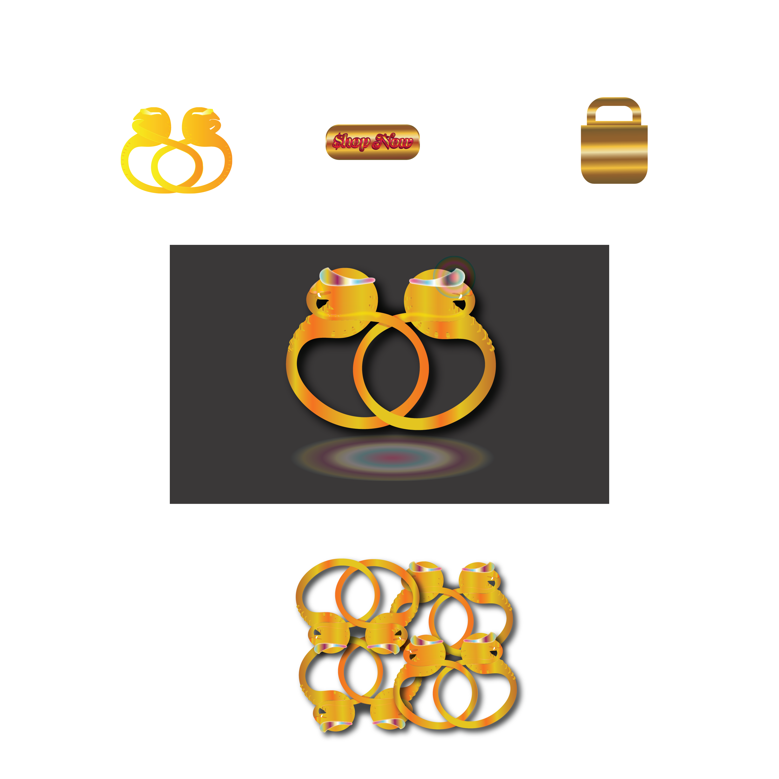
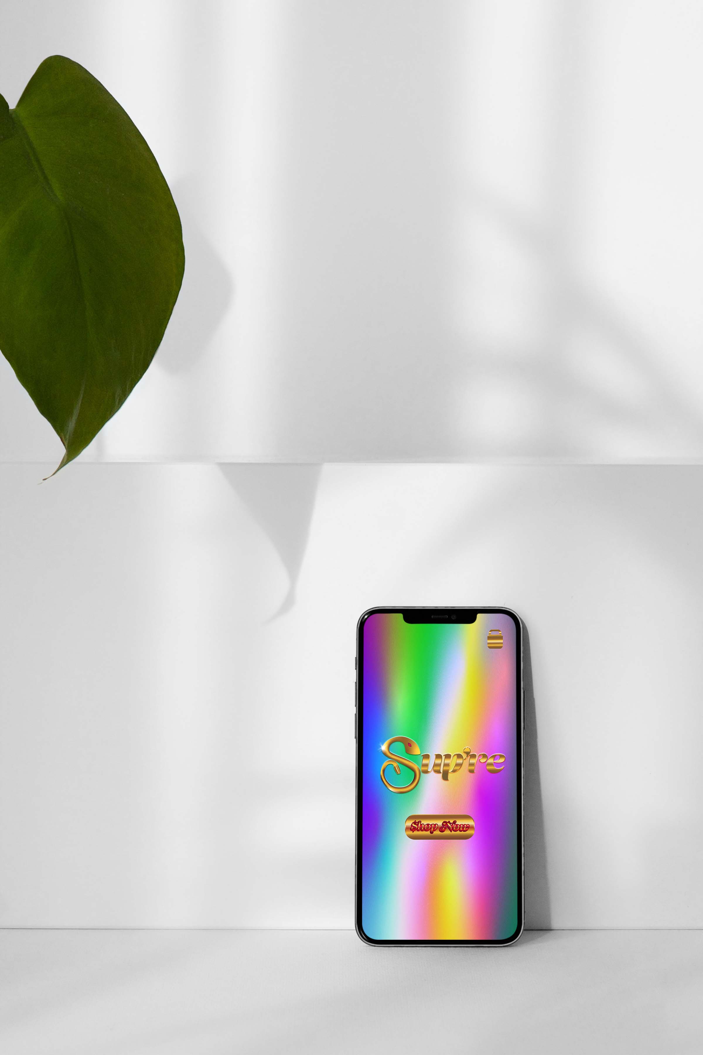
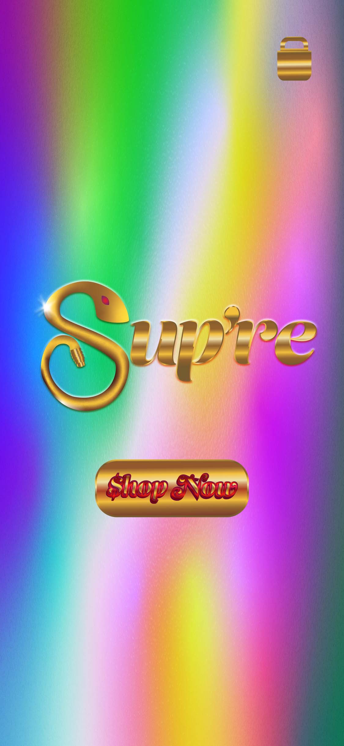
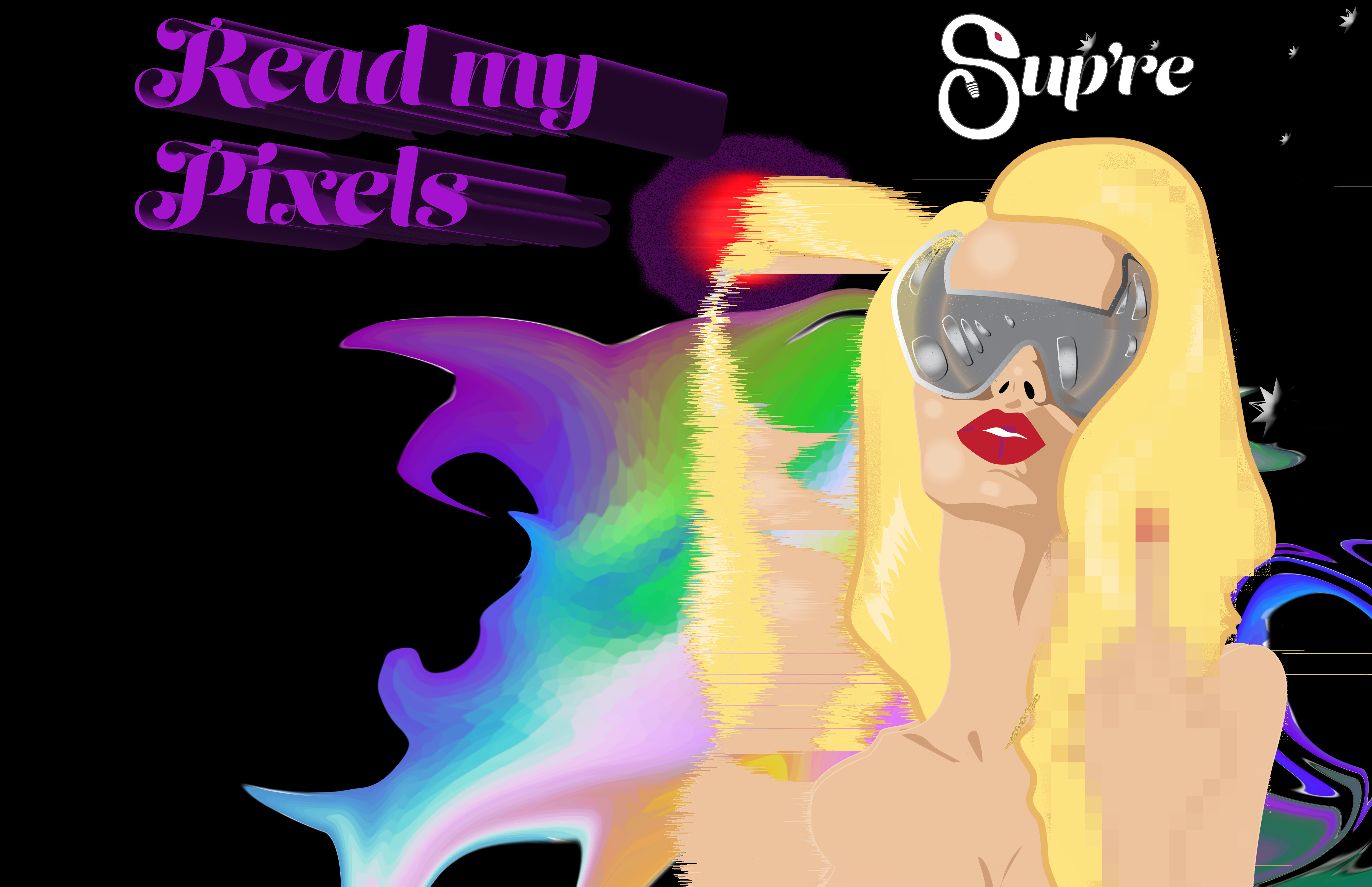
This brand is called “Sup’re,” a jewelry and accessory line with a sultry and edgy aesthetic. (The name was made to sound French, but derived from the English words “Super” and “Supressed”). The add features the staple double Caduceus/ Ouroborus snake pendant. The brand identity is sleek: gold, black, white, and a deep ruby for printed material and the logo. A magazine spread advertisement, responsive e-commerce landing page, shopping bag, and billboard were created. For the digital and web materials, a bright color palette with peacock feather-like hues as well as glitchy aesthetic were featured.Design Problem:
To create an irreverent and provocative Fashion accessory label which could be expanded upon in the future with more product design (i.e. the Devil Horn glasses which were illustrated in the ad). The brand identity features snake symbology which is an overarching theme in my work and I never tire of exploring it. This is also intended to be expanded upon and features my original illustrations and Snake Pendant which I had 3D modeled and printed into a necklace.Design Solution:
I wanted to be more mindful of print production versus digital production, product design, and marketing when I started brainstorming ideas. I kept the brand colors to a minimum but used a lot of bright, playful, optimistic colors for the digital media and illustrated advertisement (with the idea in mind that I was an illustrator being commissioned to create assets for a brand). I want to explore more product design and more methods of making my illustrations into glitch art (i.e. using plugins in after effects to make animated glitch video art, which I have used in the past and want to go deeper with).Design Process:
The typeface “Lust” was manipulated in Illustrator to make the “S” into a snake, and the gold gradients were added to give a bezel effect. The snake logo was done prior and Golden ratio proportions were overlaid as a template to keep the proportions harmonious to the eye. For the illustrations and page layouts I drew rough and thumbnail sketches, (several iterations before finalizing them), then scanned the refined sketches in (and possibly cleaned them up more in Photoshop) before vectorizing, coloring, and compositing them in Illustrator. For the advertisement, all my original illustrated assets, including the holographic pattern background, were composited in Photoshop. I then had a lot of fun glitching it out with the “Wind” and other distortion effects. The profane hand gesture of the illustrated centerfold was also strategically pixelated using masking and the Photoshop filter. The centerfold was duplicated and different blending modes were used such as dissolve for more selective, masked texture and grainy glitchiness.Process Sketches and Brand Assets:
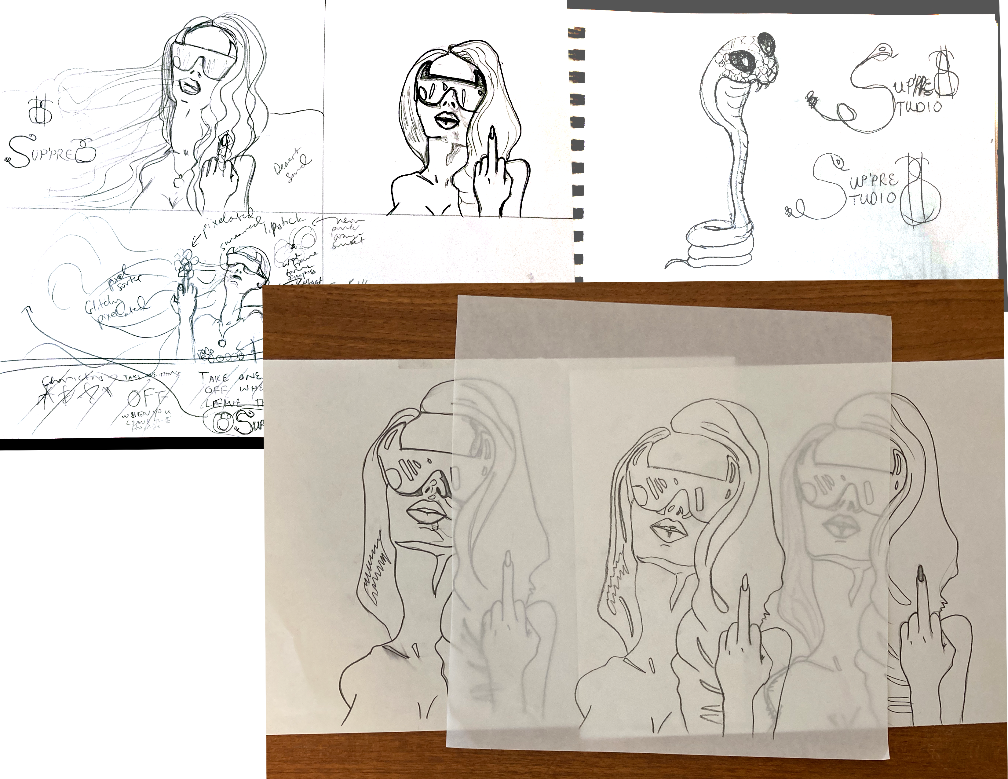

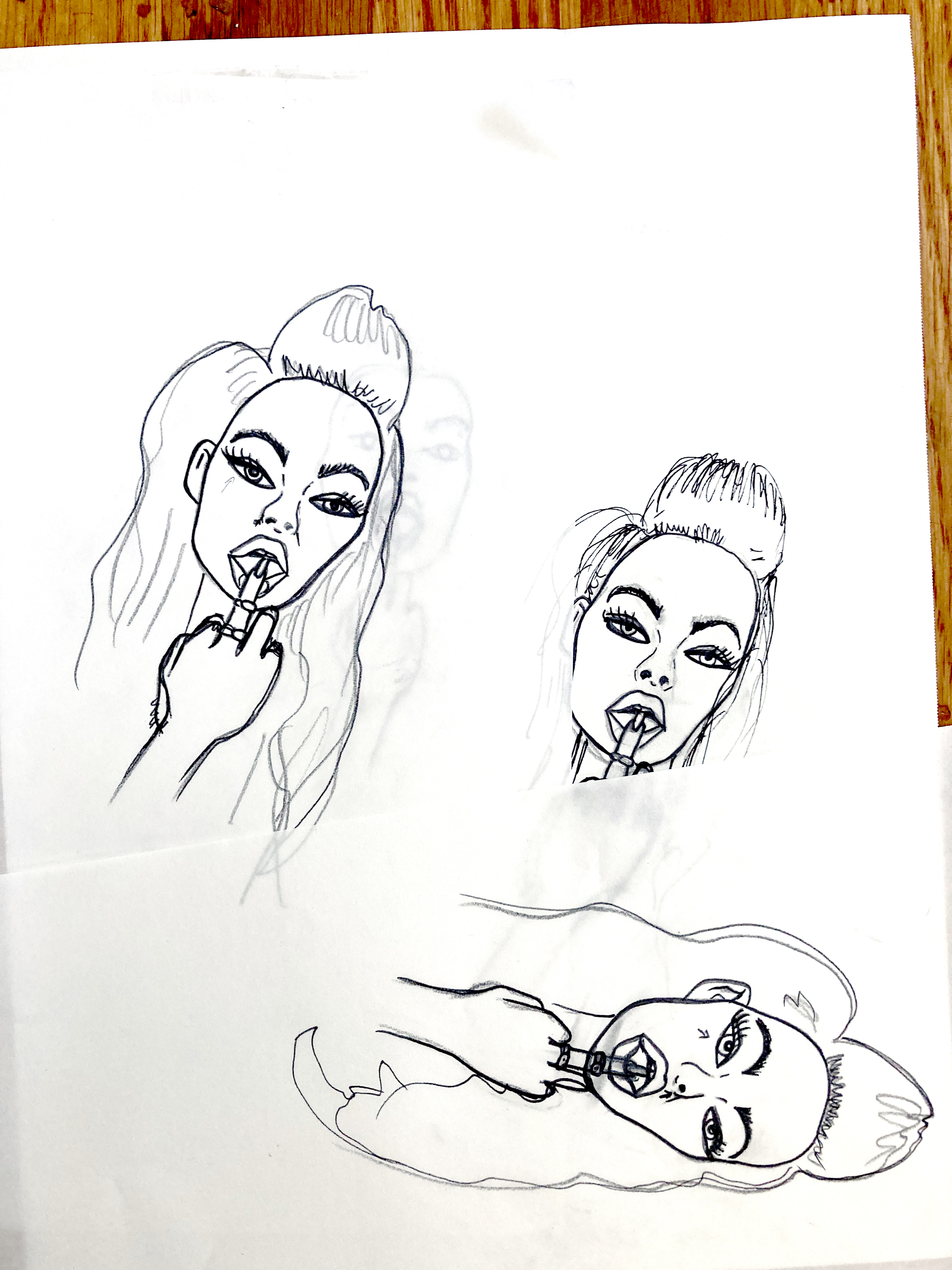
Uncensored Girl Vector Illustrations Created


Shopping Bag pattern mockup
 Ad Version 1
 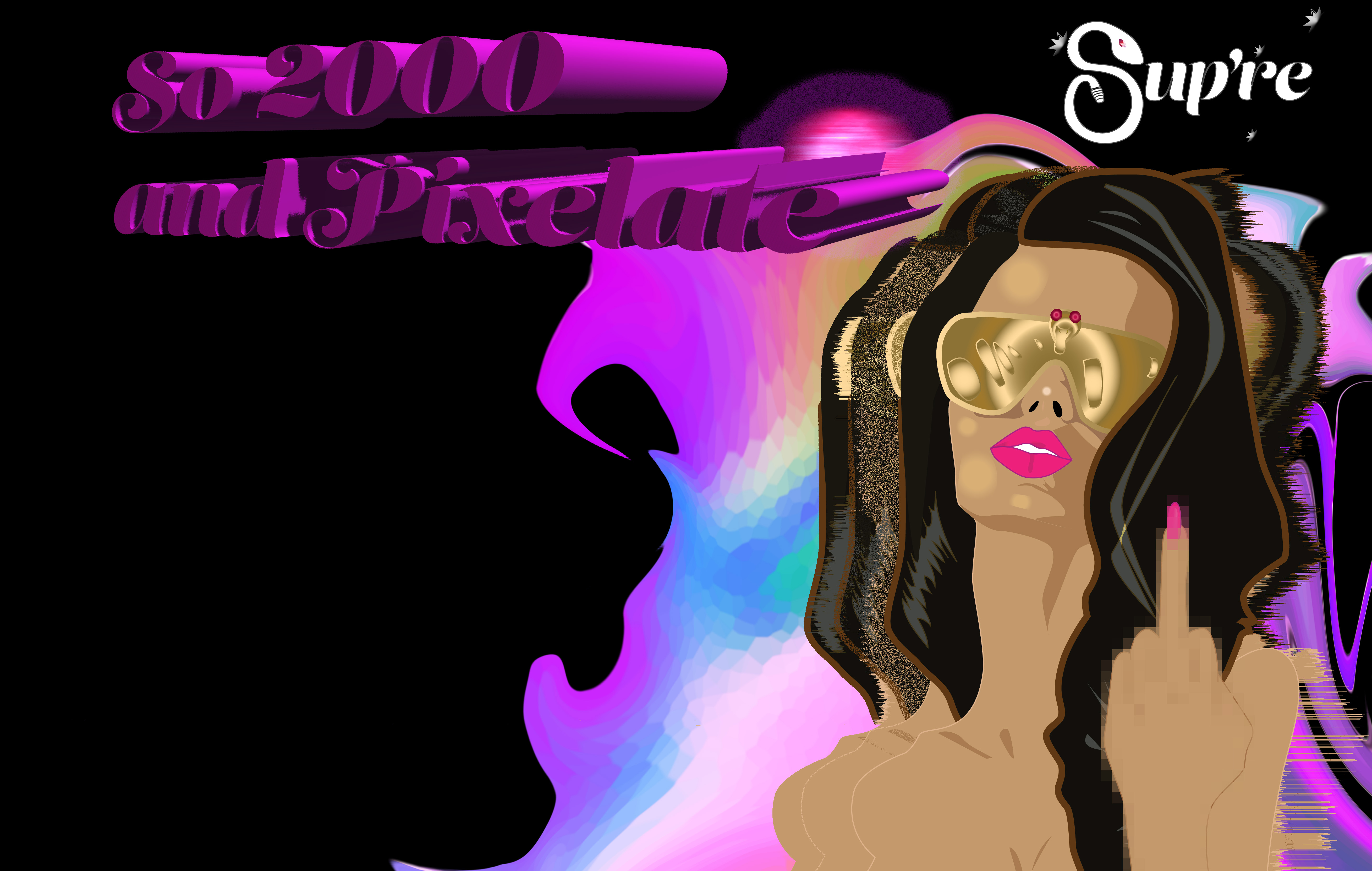 Ad Version 2
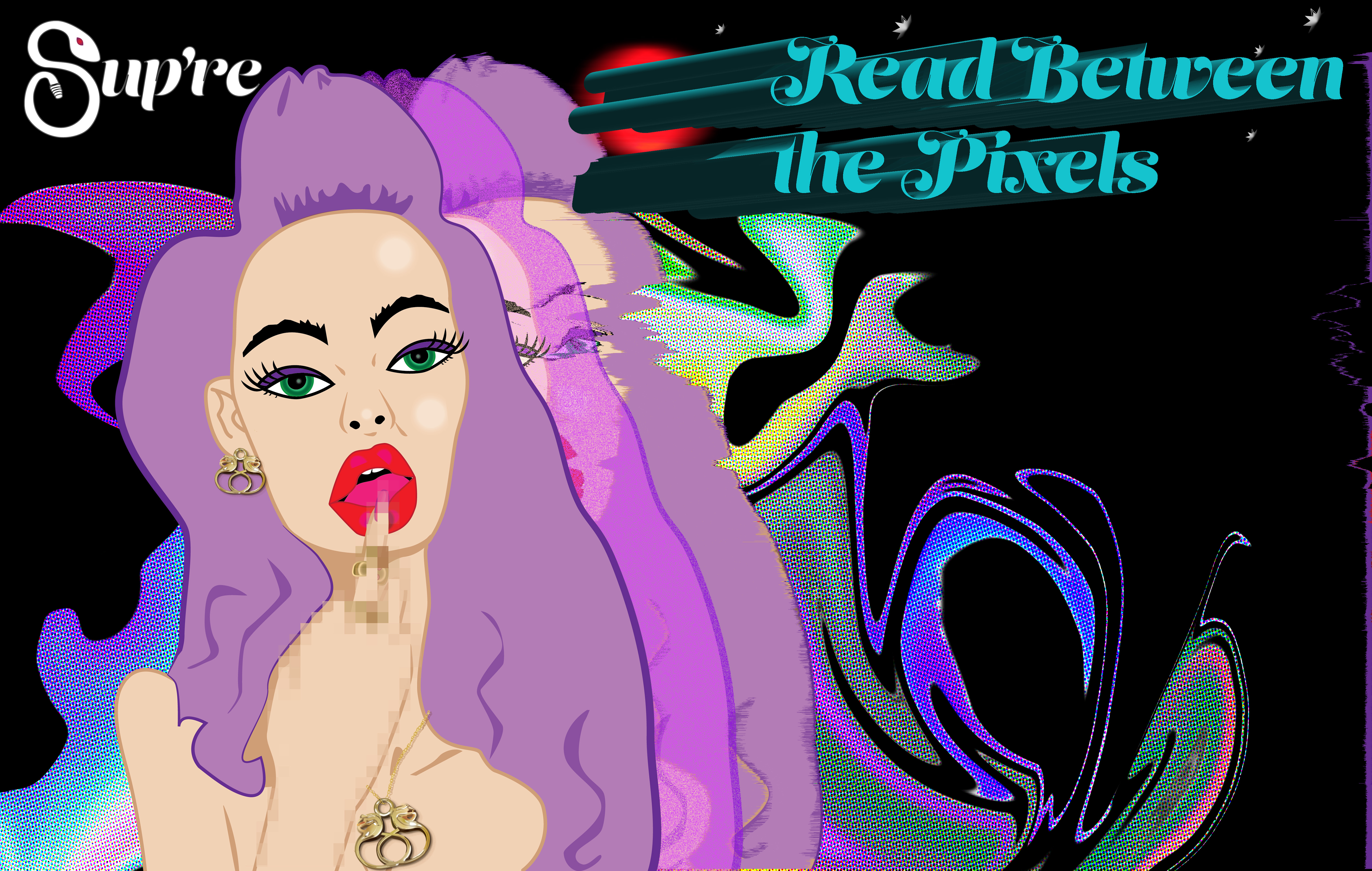
Ad Version 3

Ad Sign Shopping Center

Billboard

Street Signs