“Metanoid Magazine”
Category:
Magazine Design and Layout, Copywriting, Glitch Art and Design, Animation, Social Media Marketing, Print Production.Target Audience:
16-65 year olds who follow both digital and analog glitch art and synthesis. They are people who stay informed in the Art and Design world and also are interested in technology and new media.Software Used:
Adobe Illustrator, Photoshop, InDesign, After Effects, Ableton LiveDesign Process:
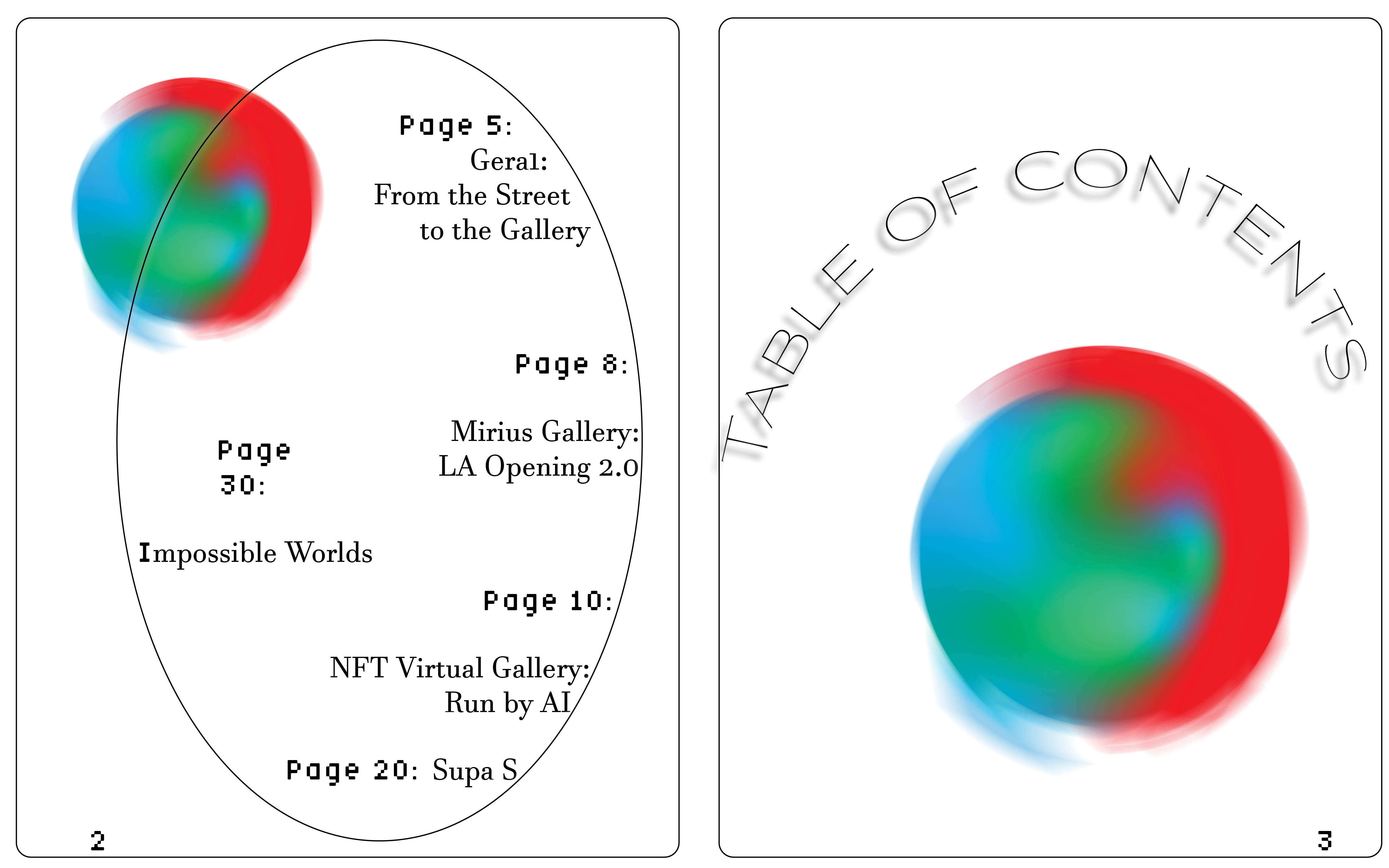
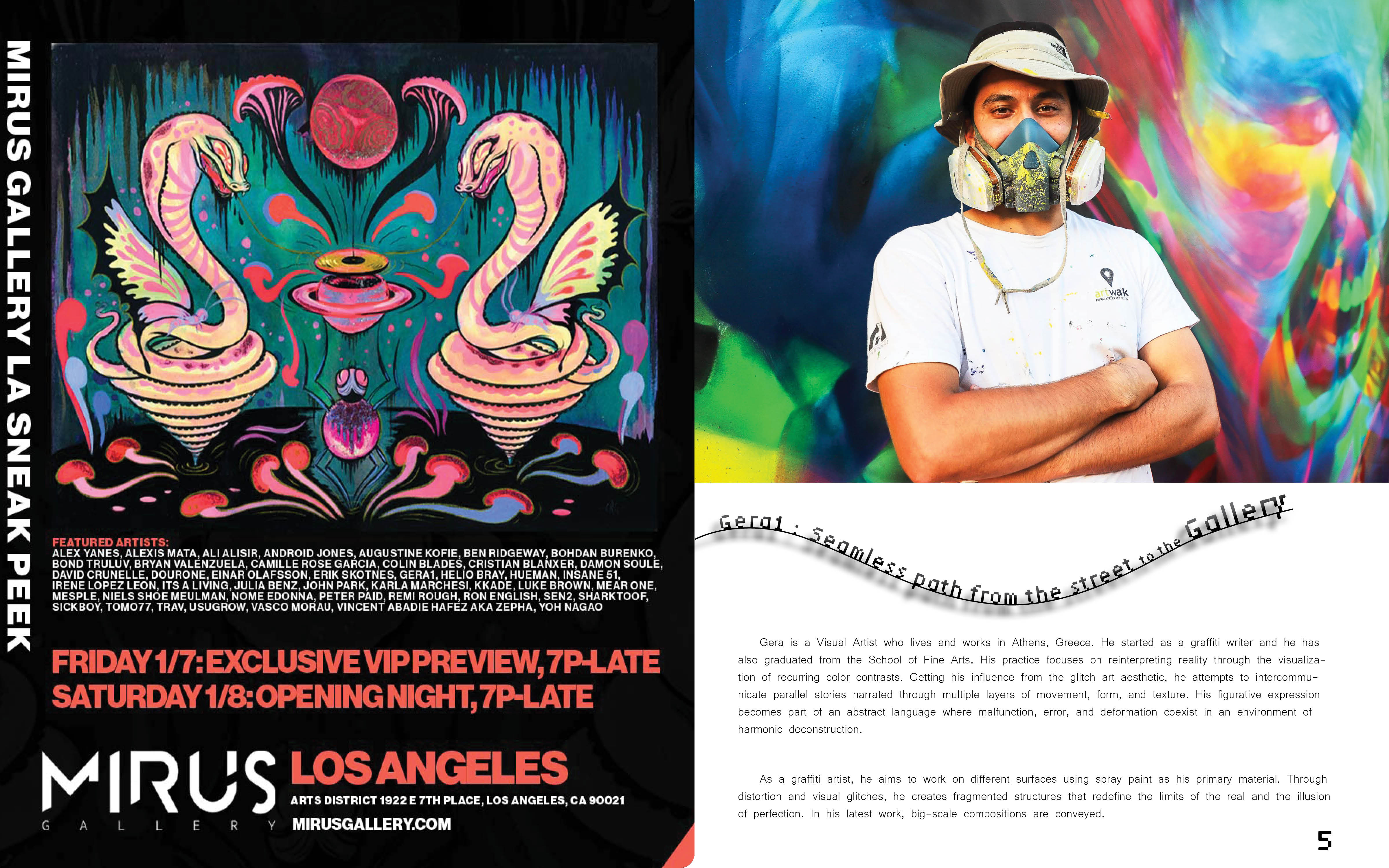
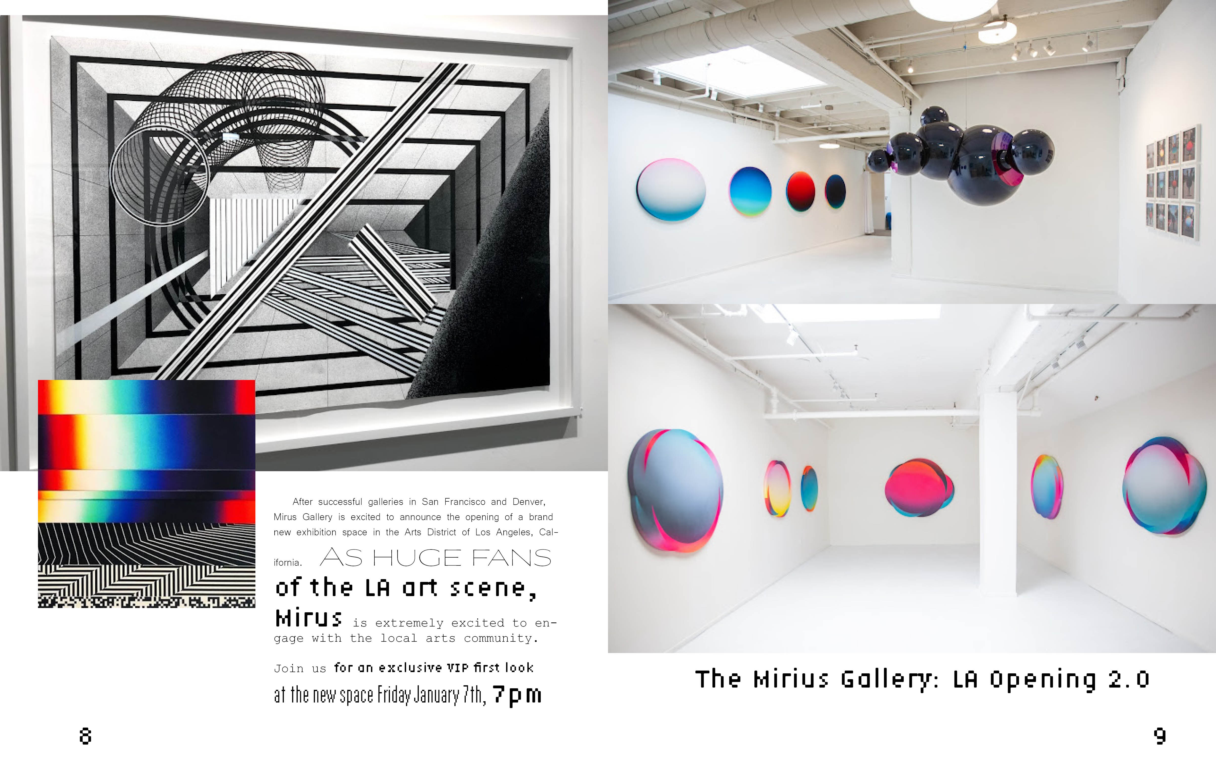
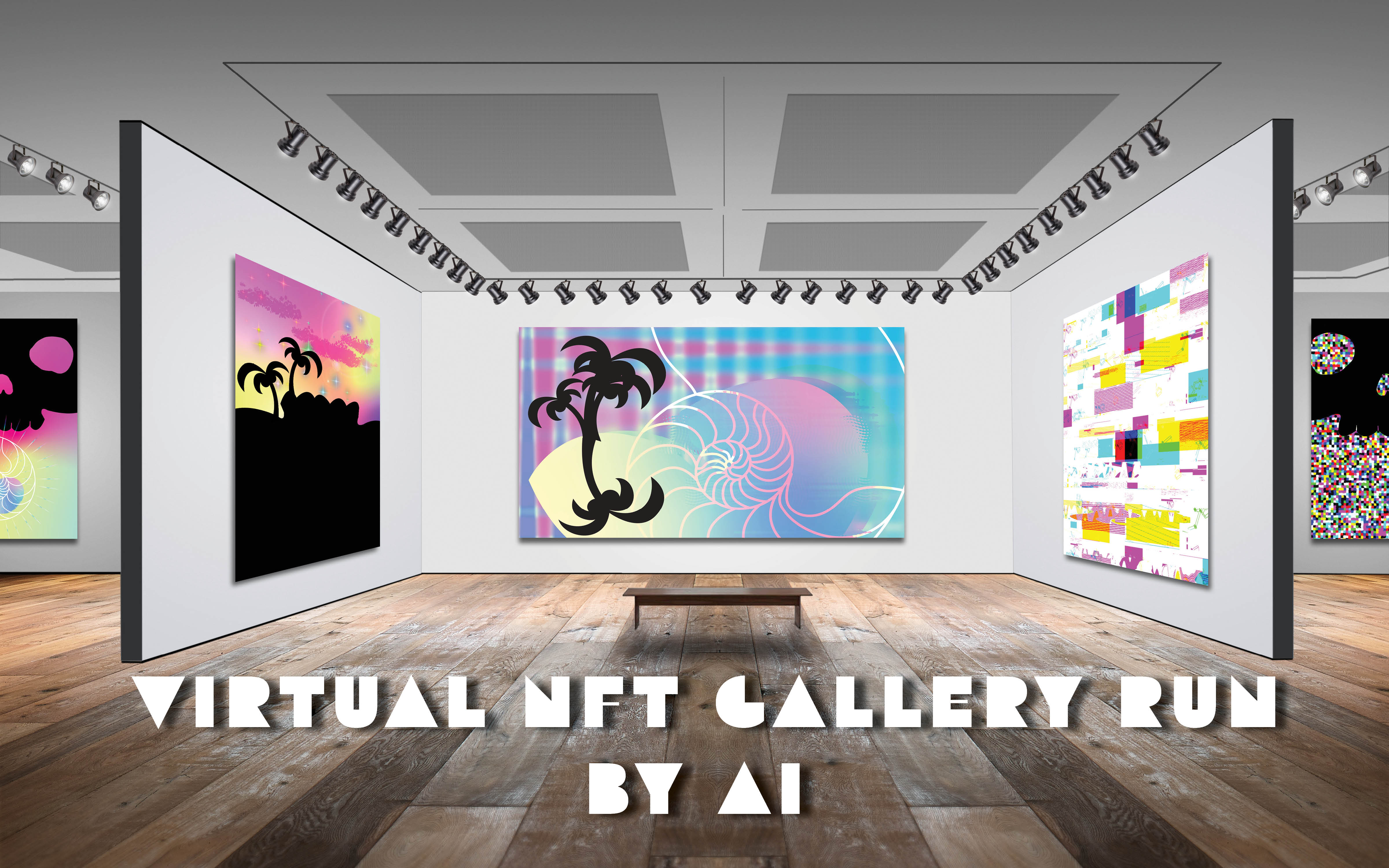
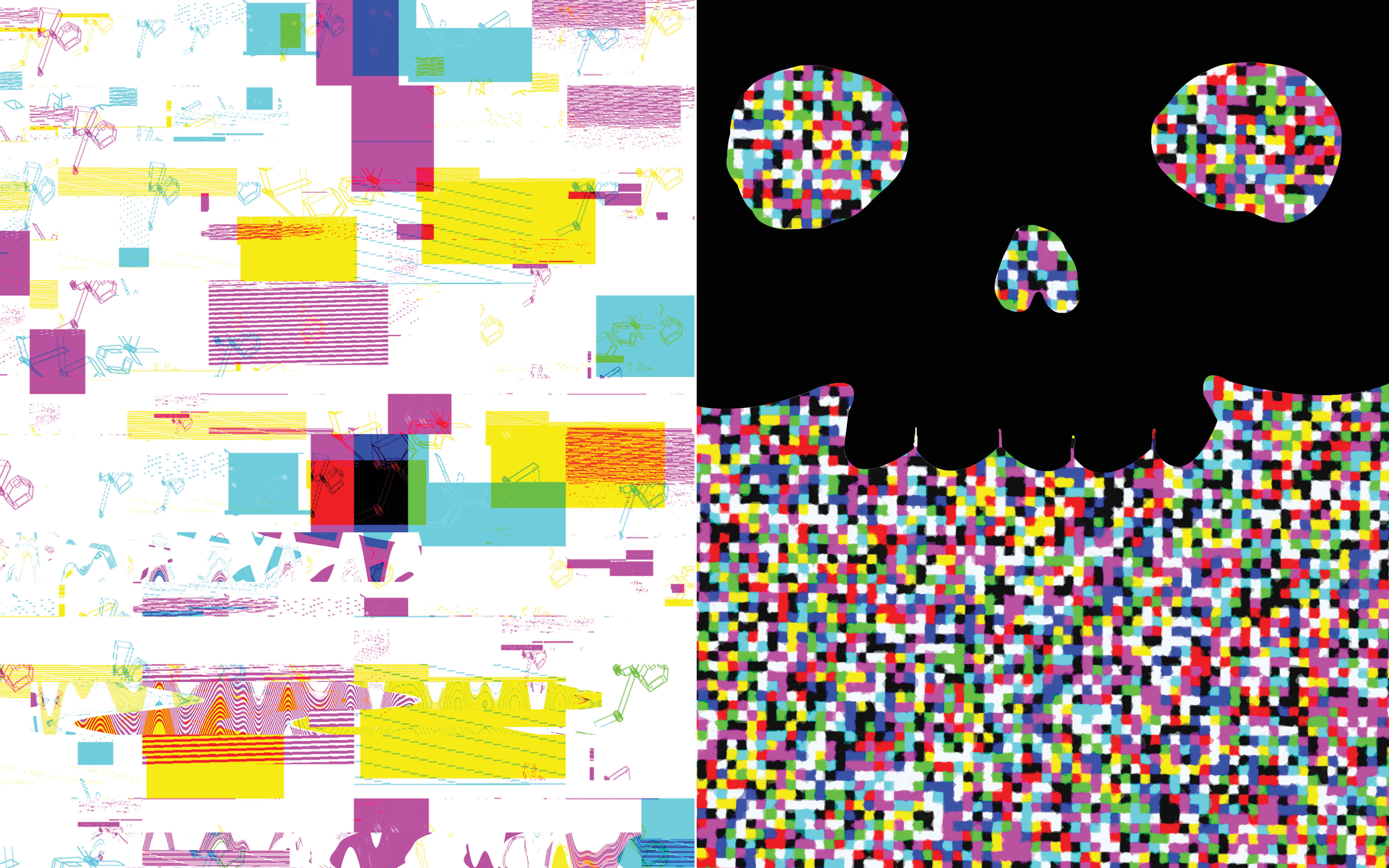
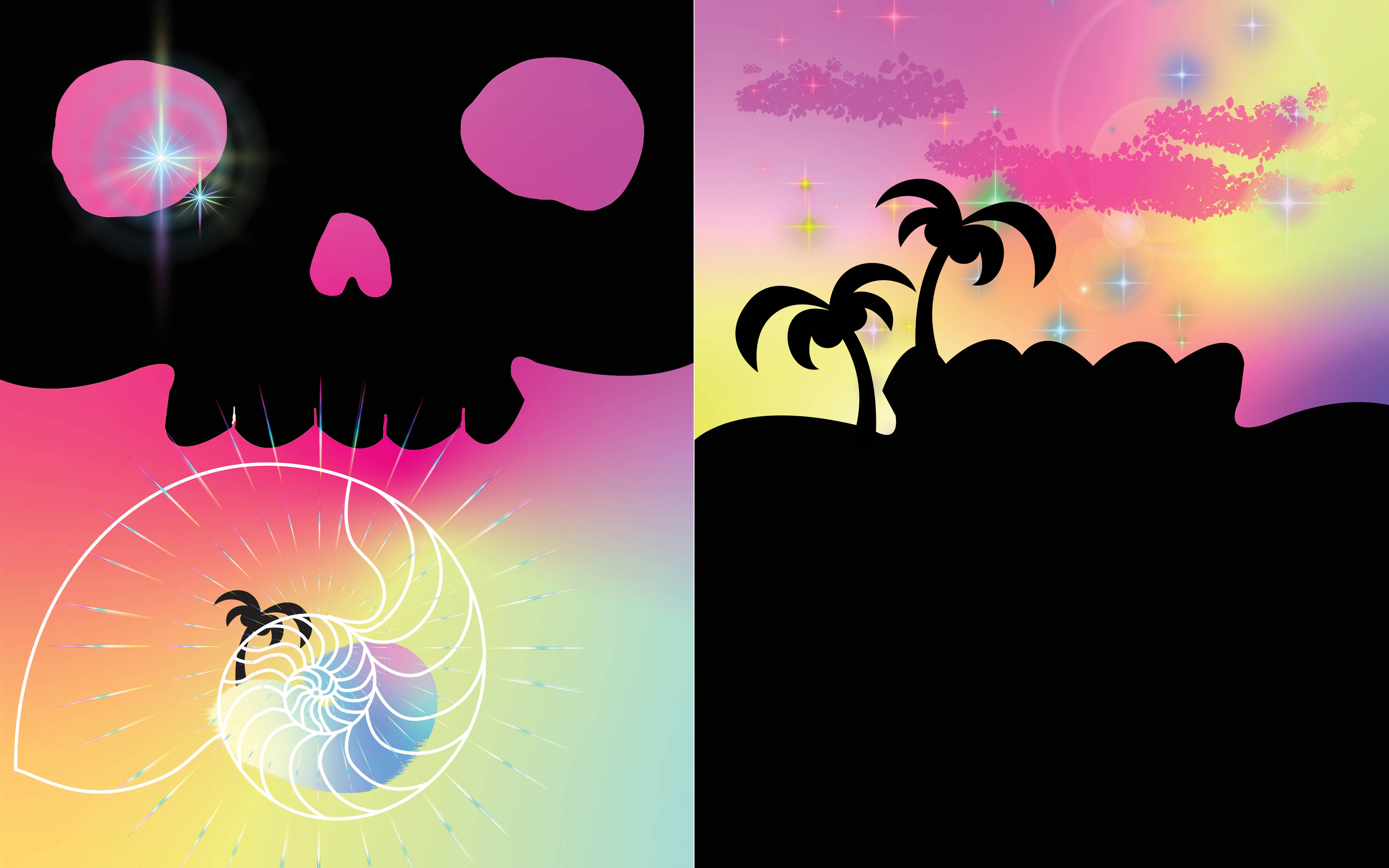
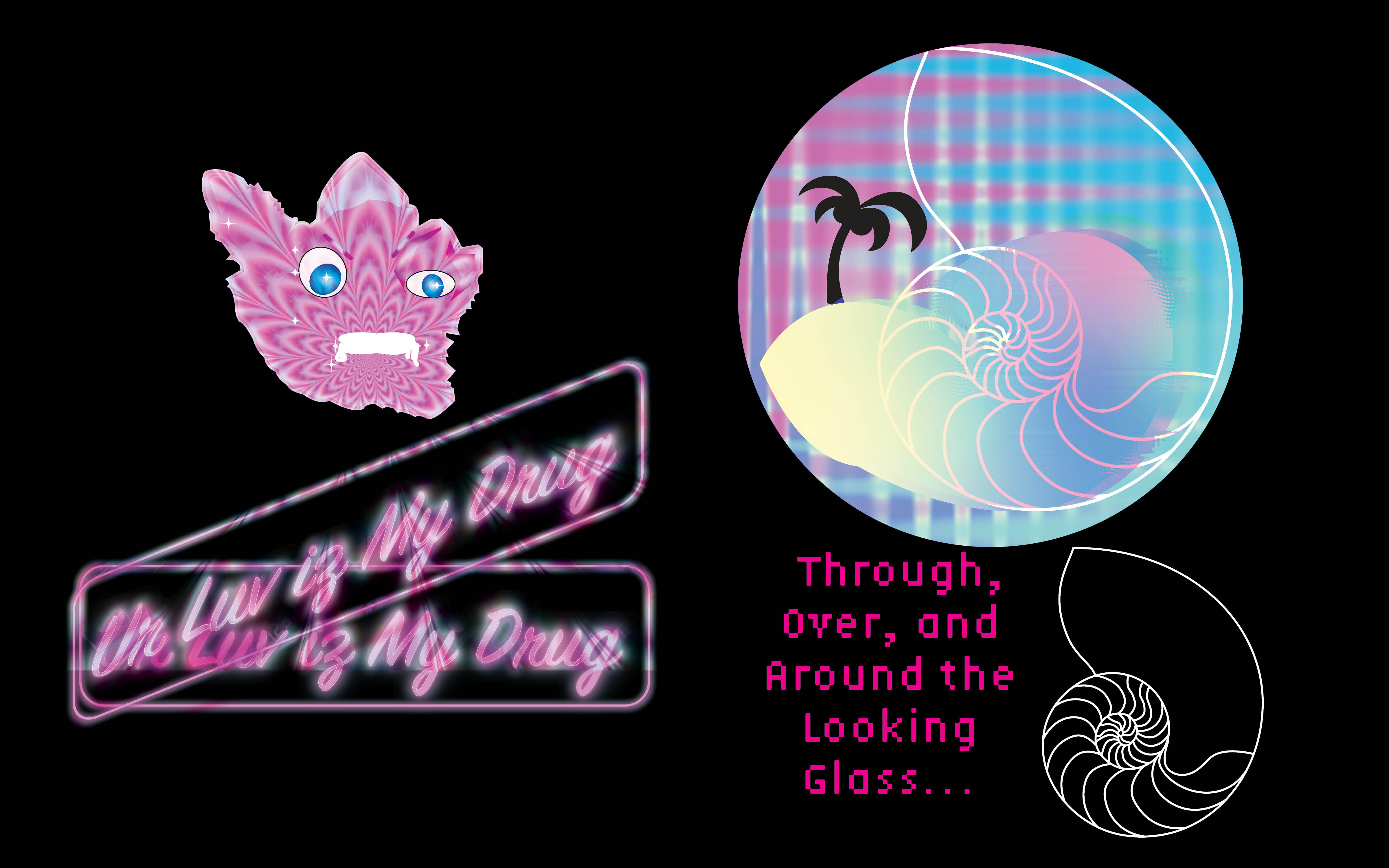
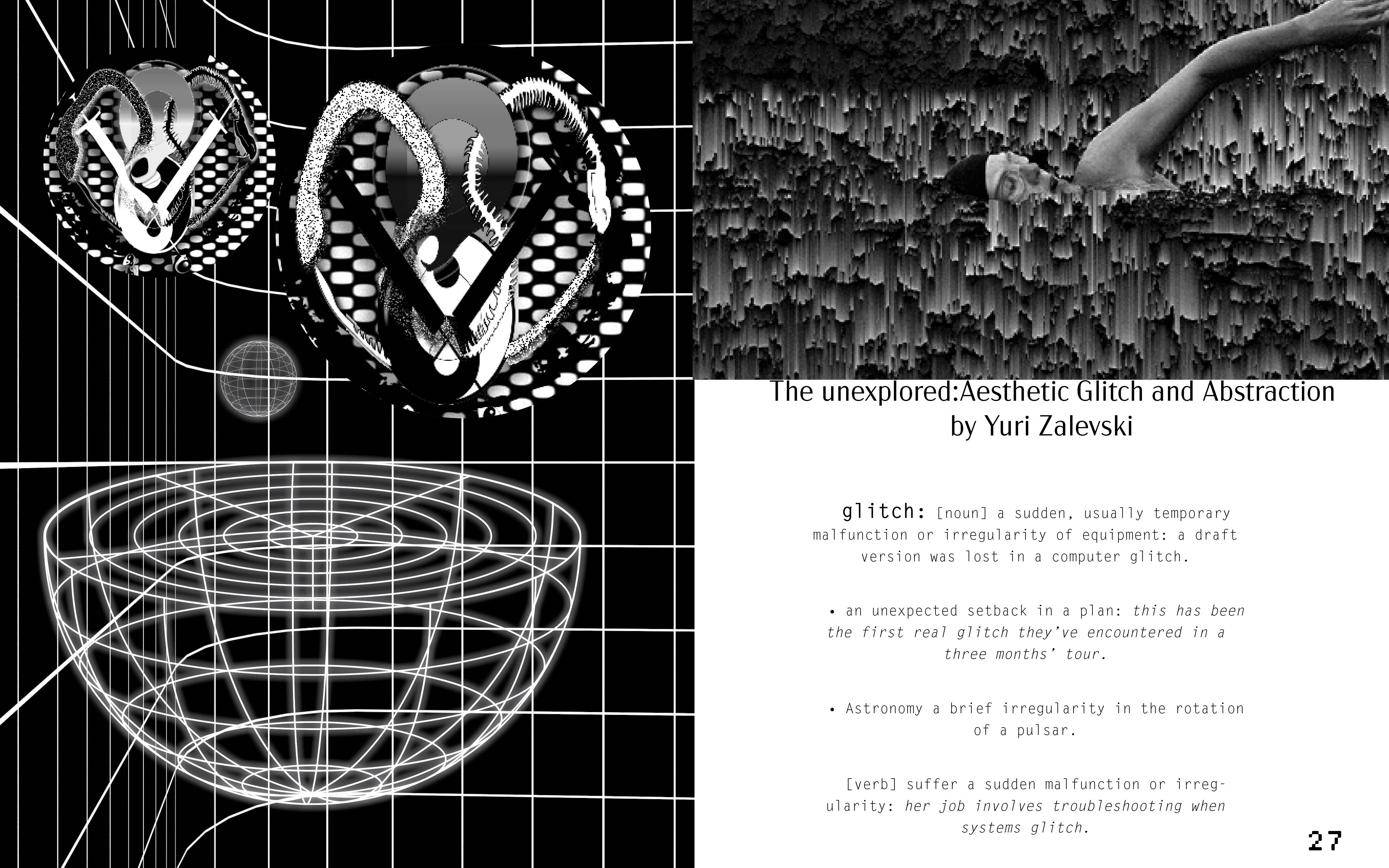
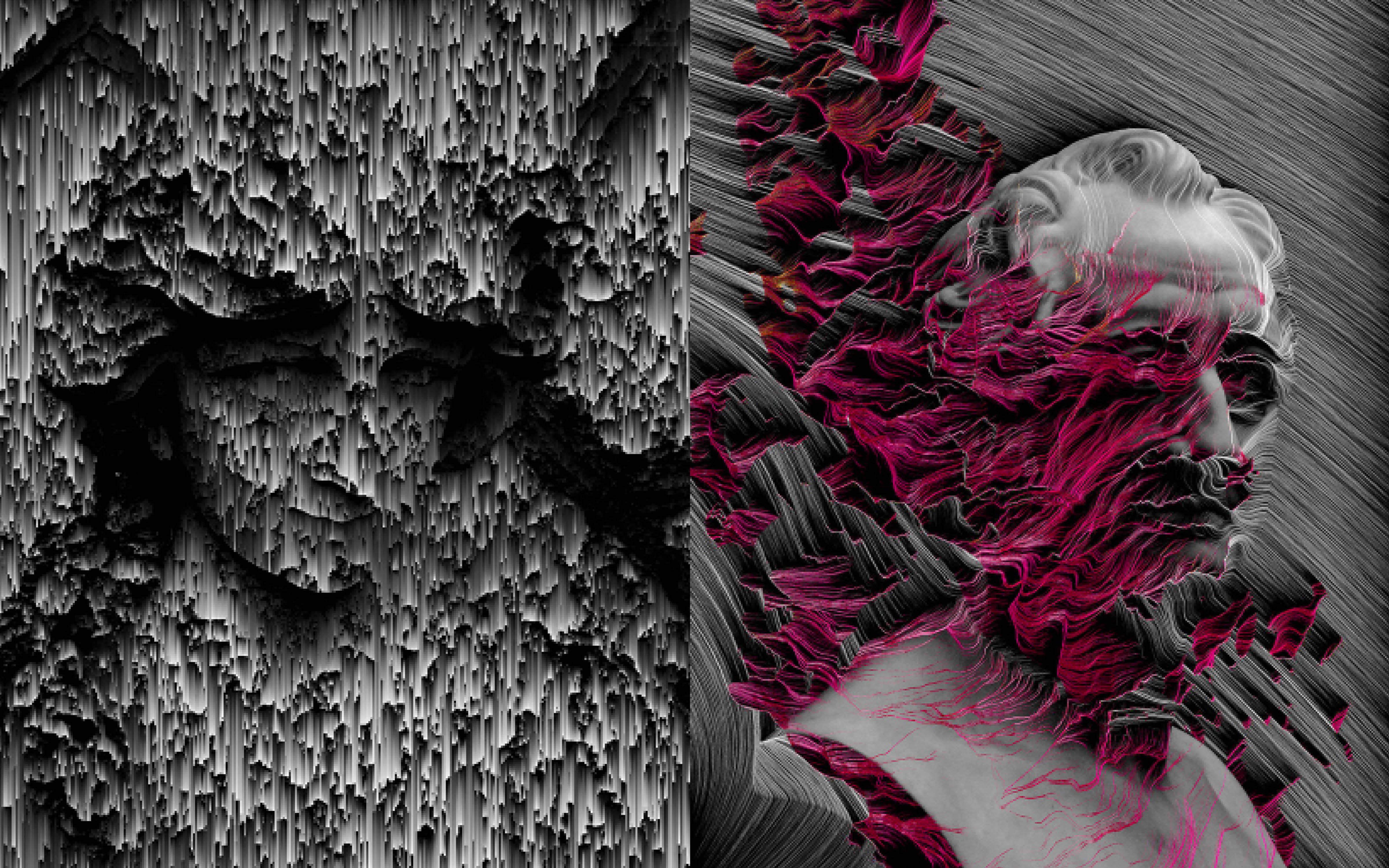
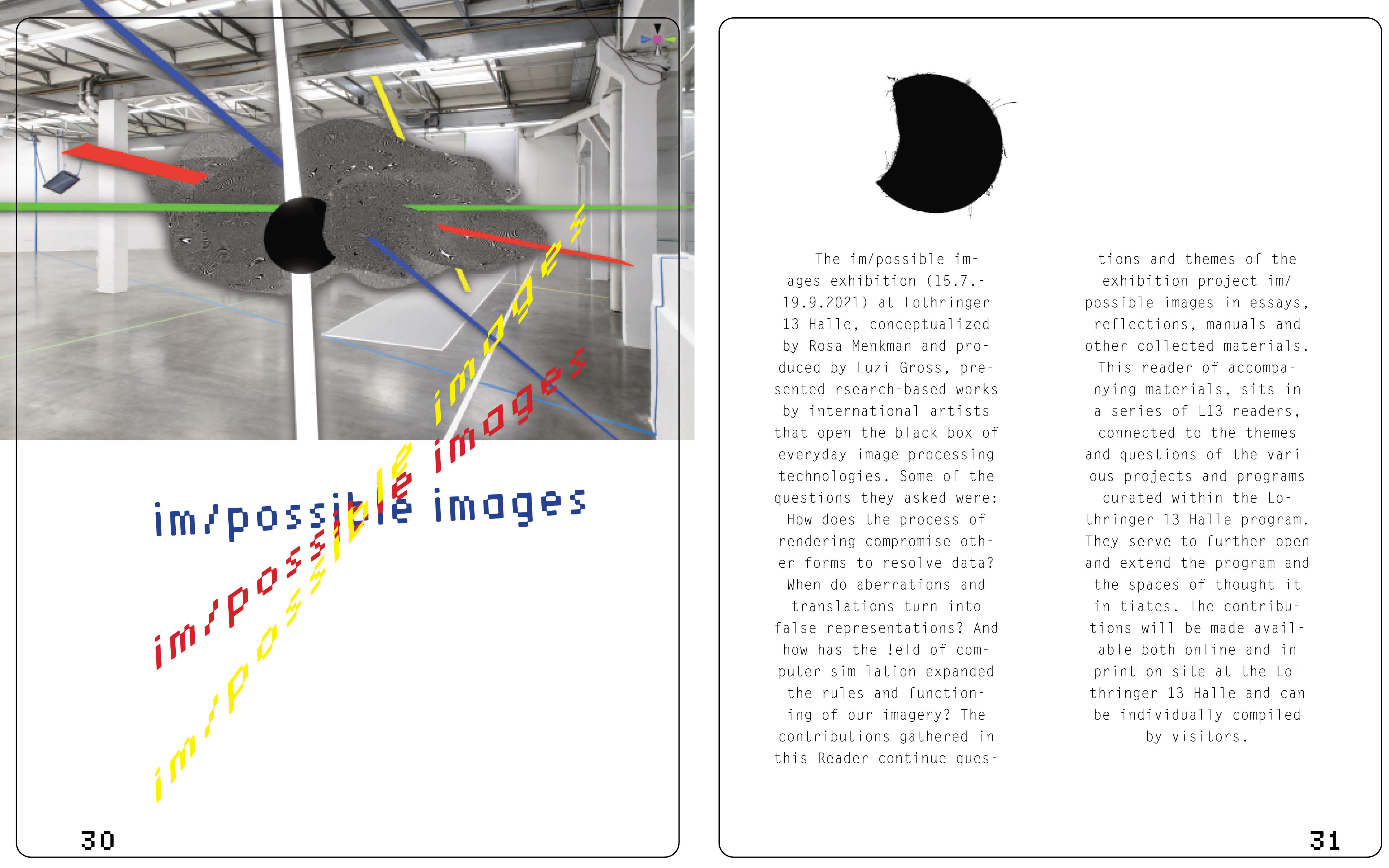
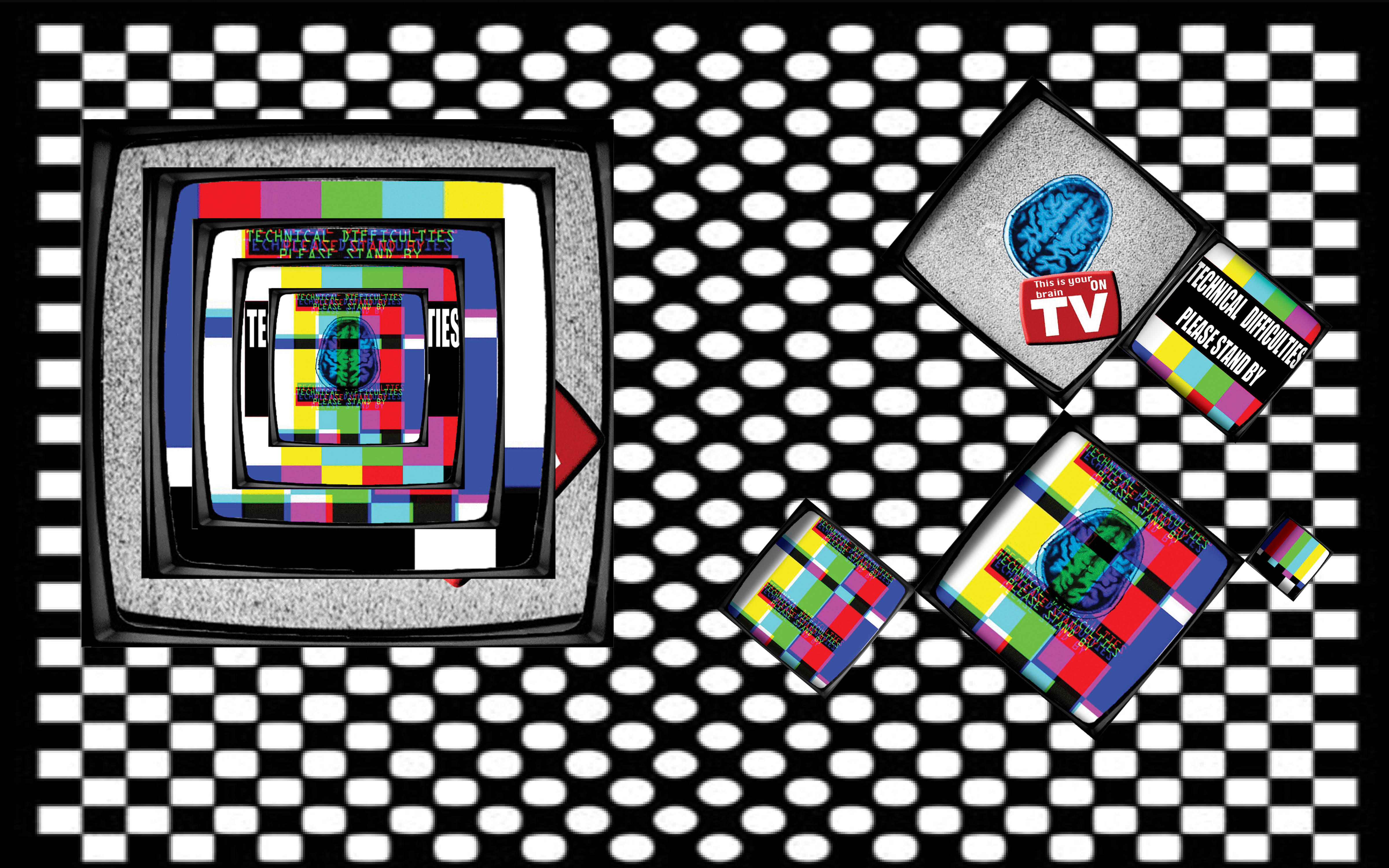
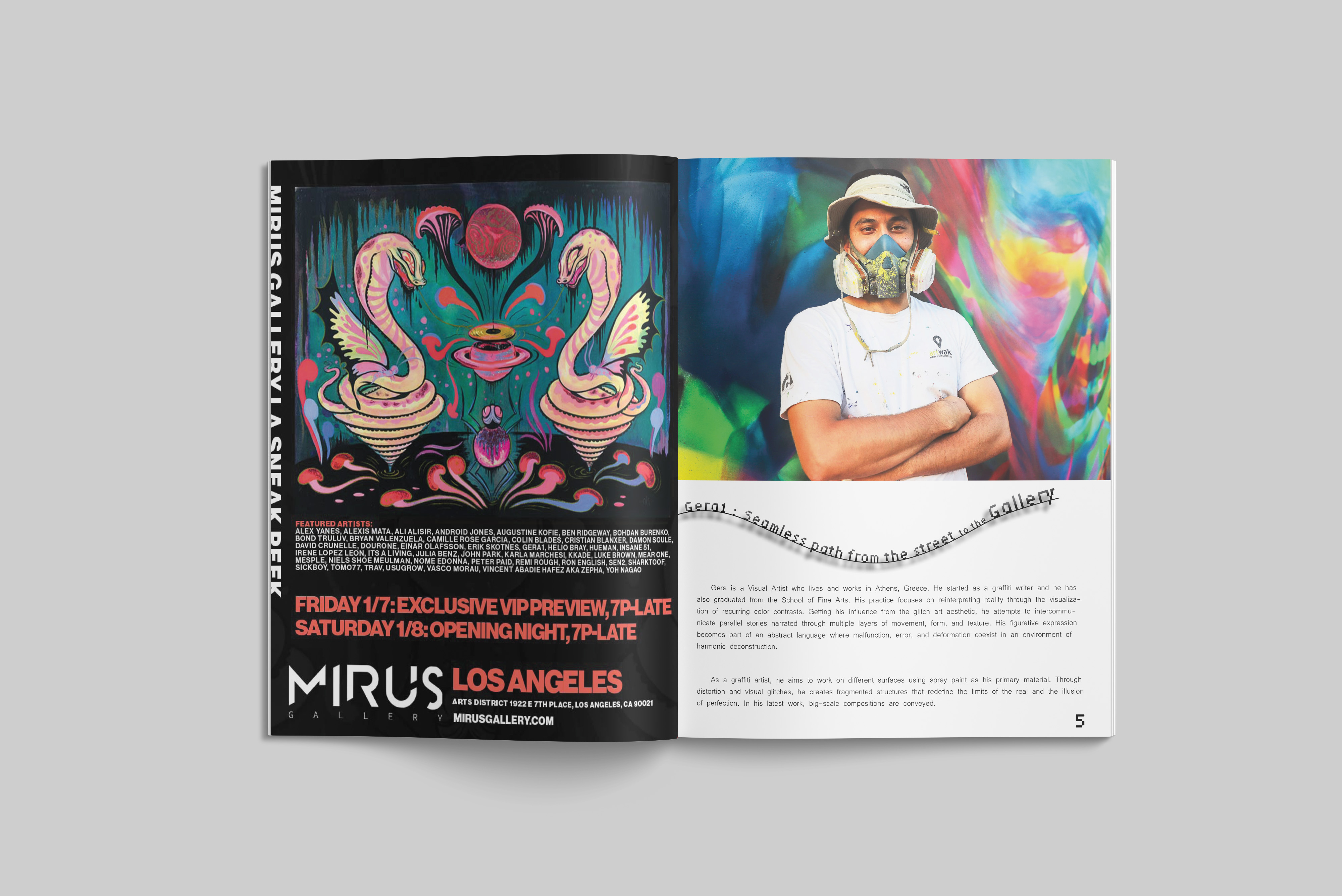
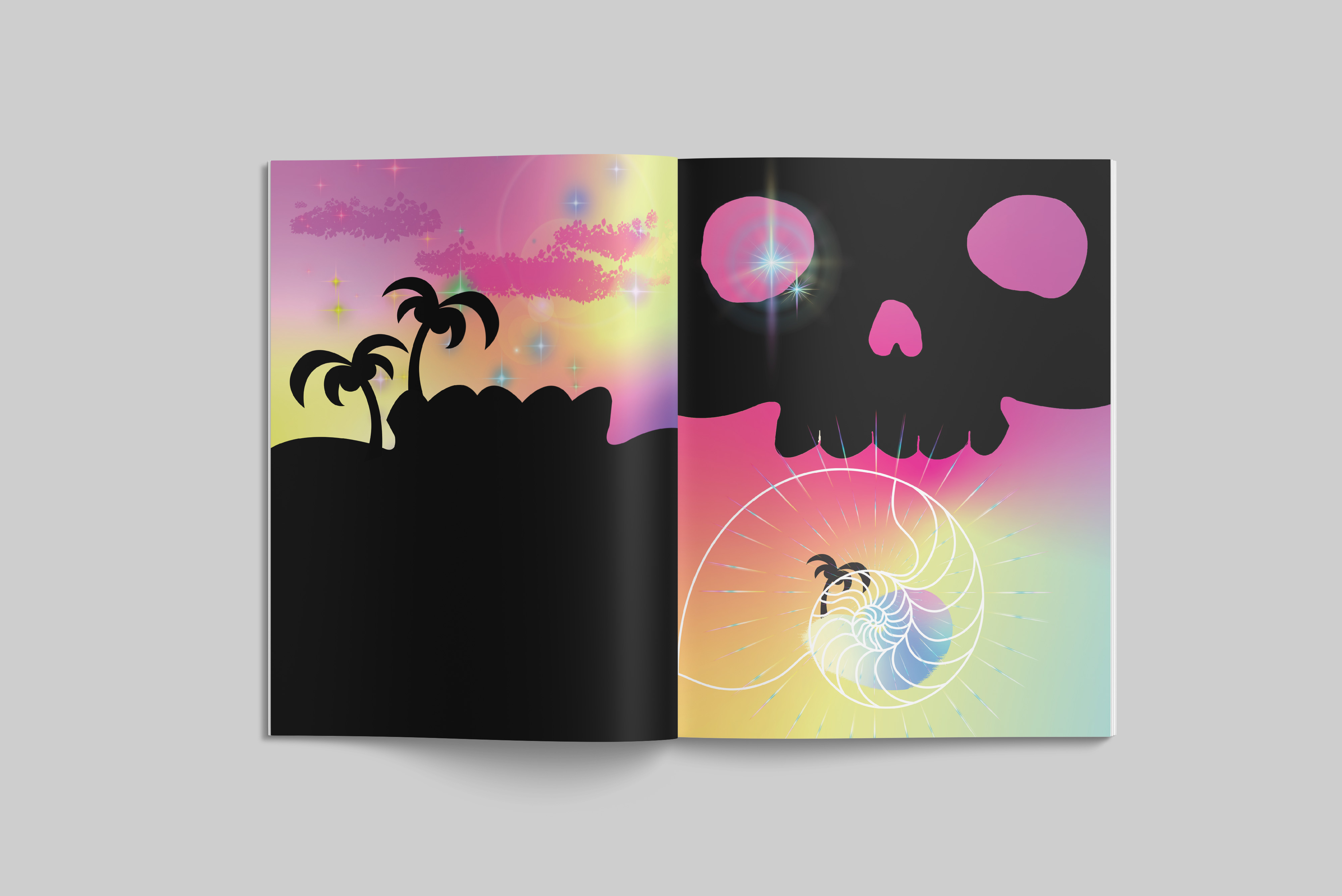
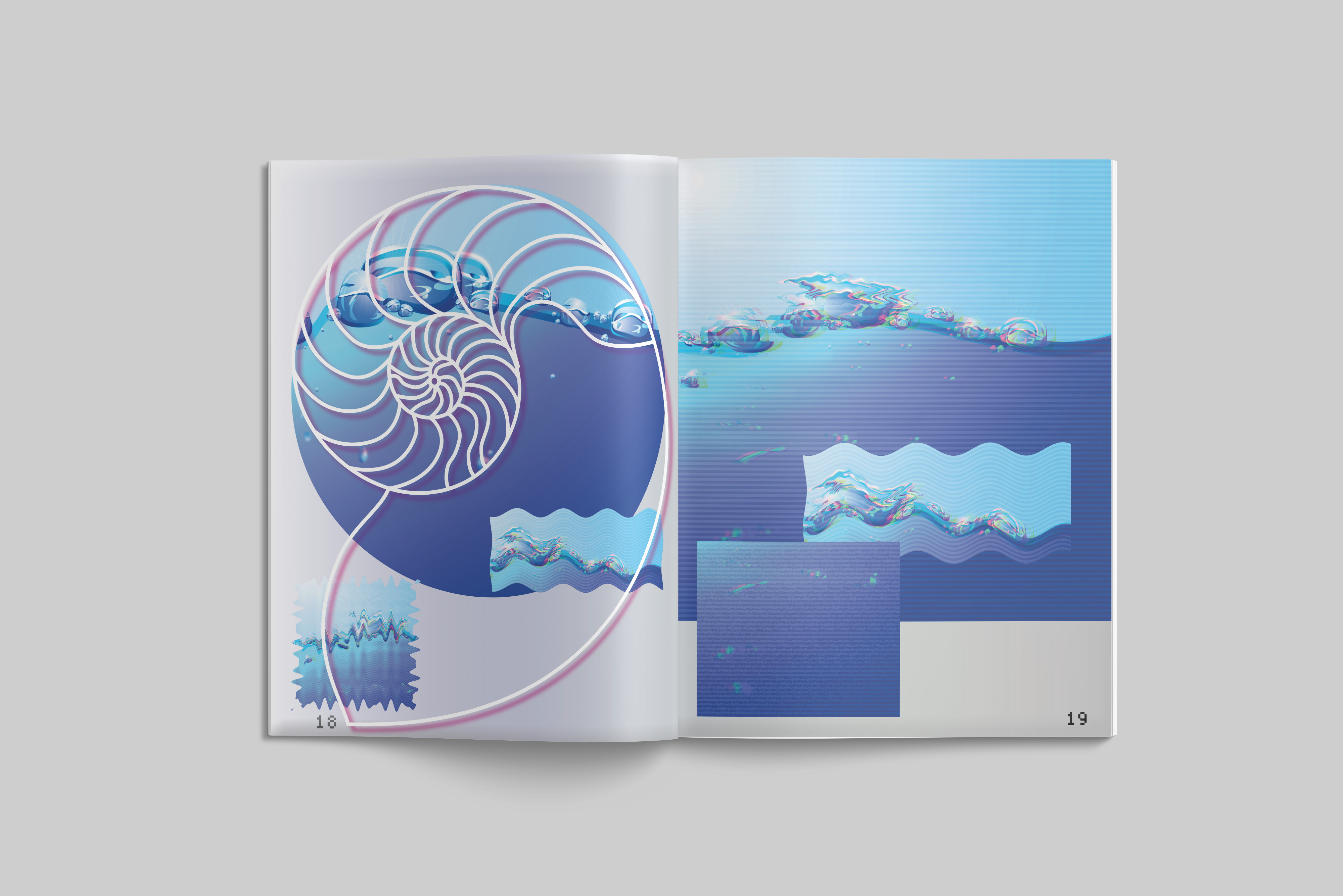
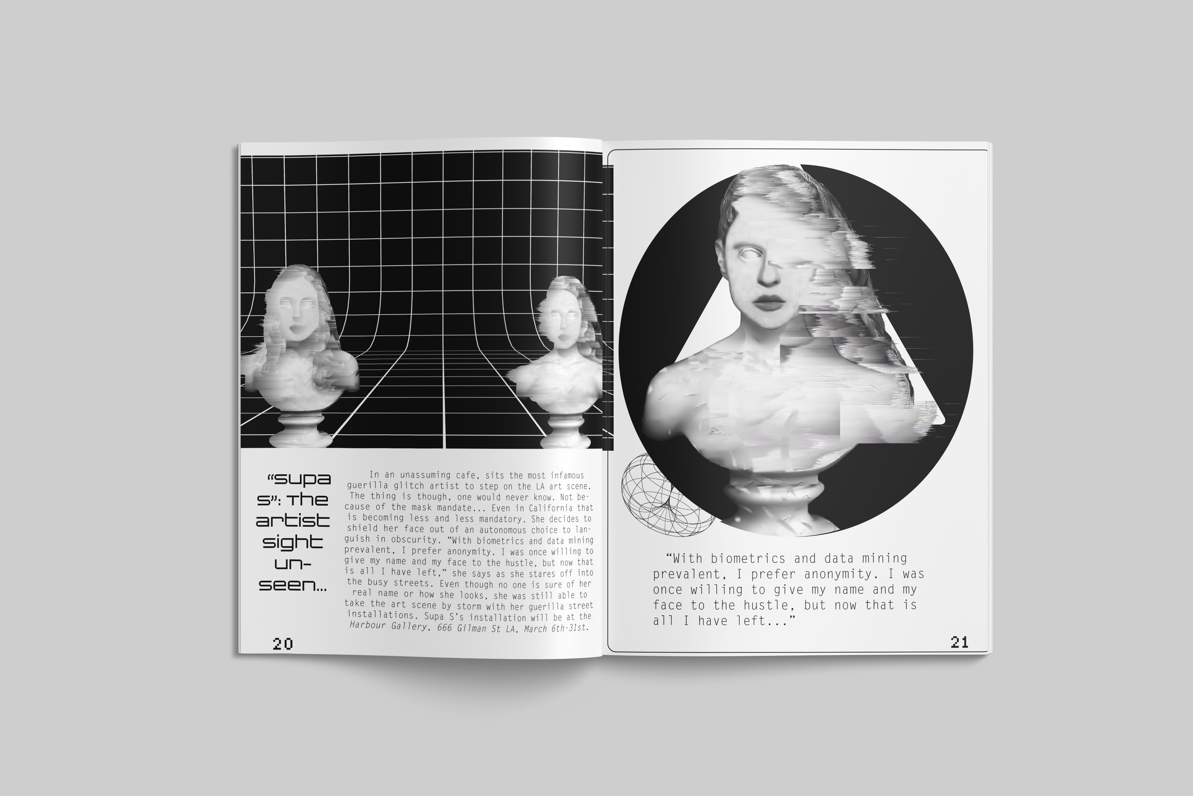
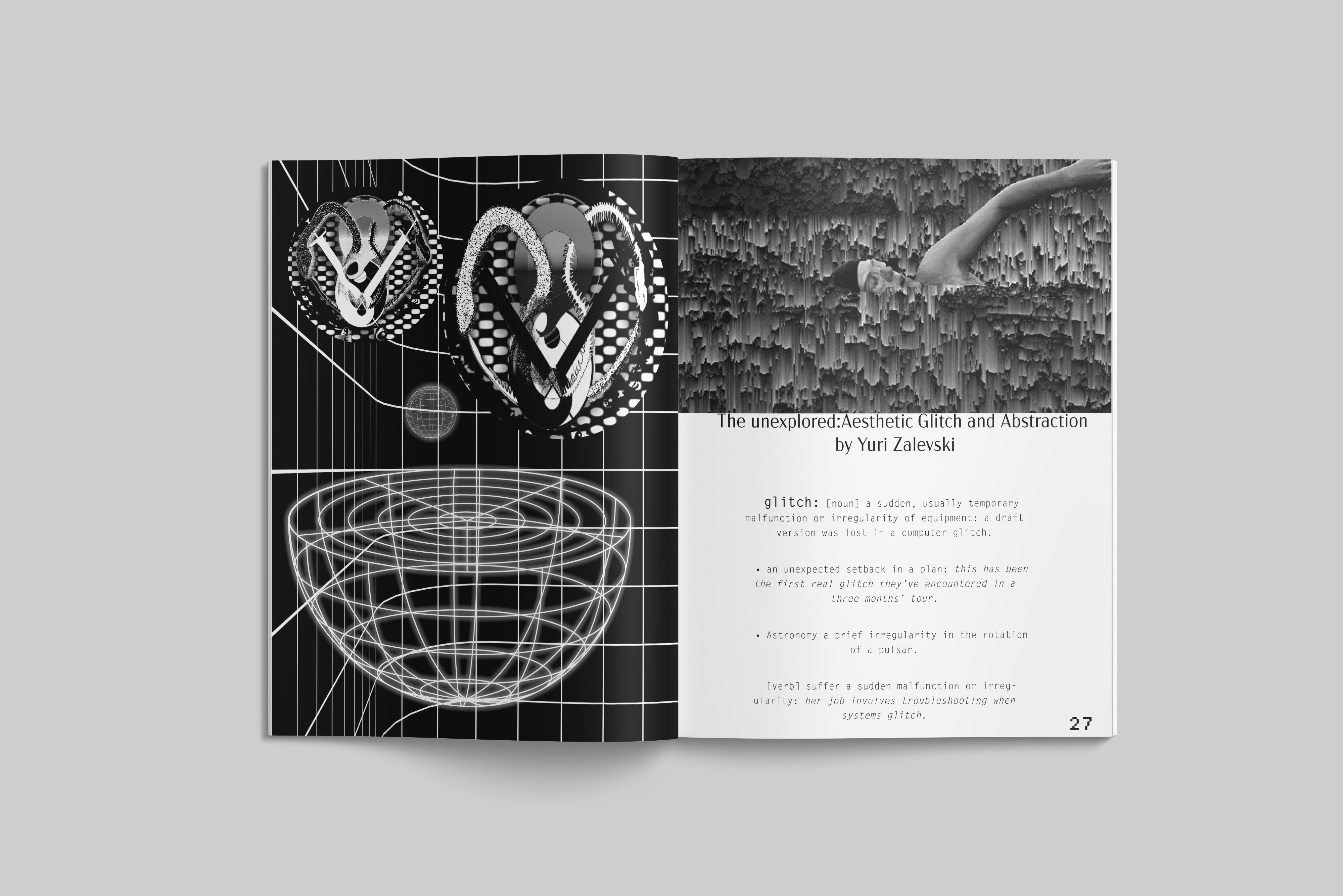
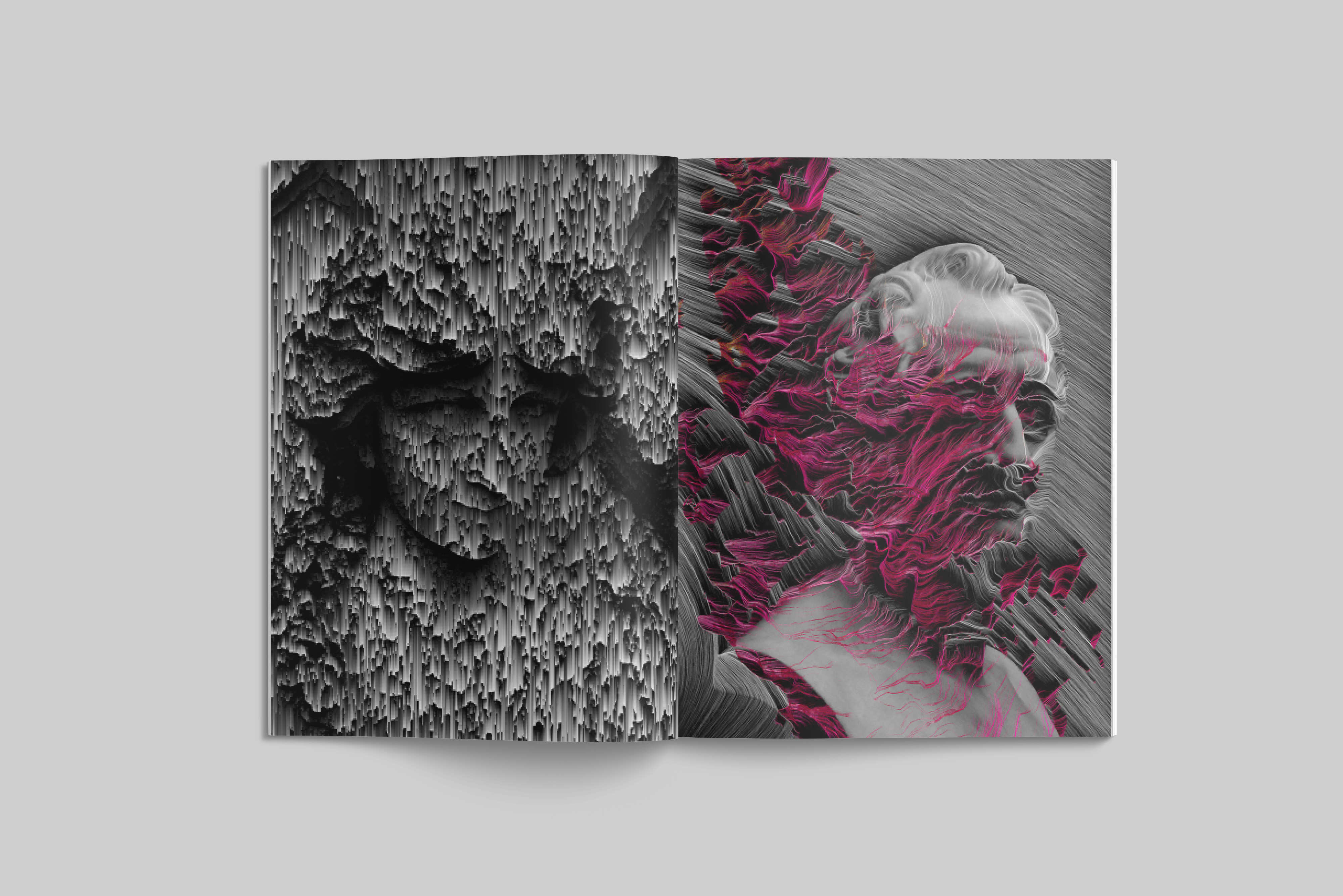
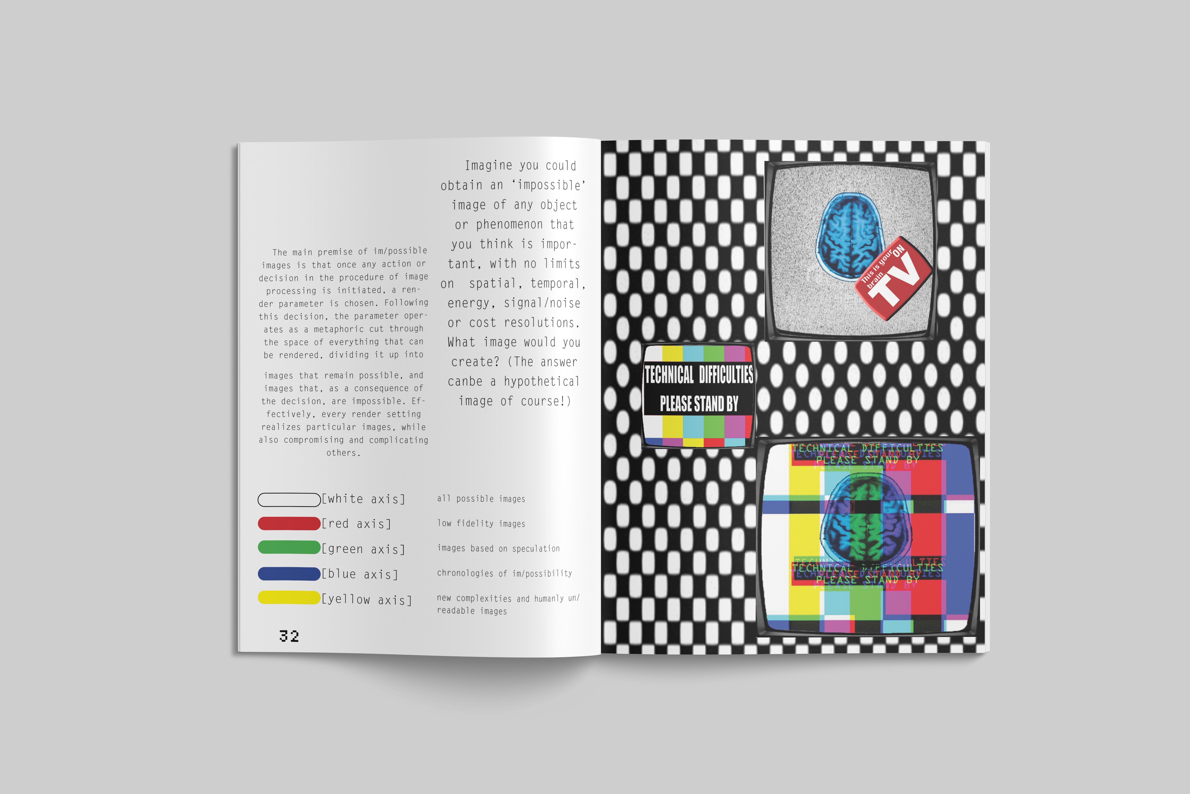
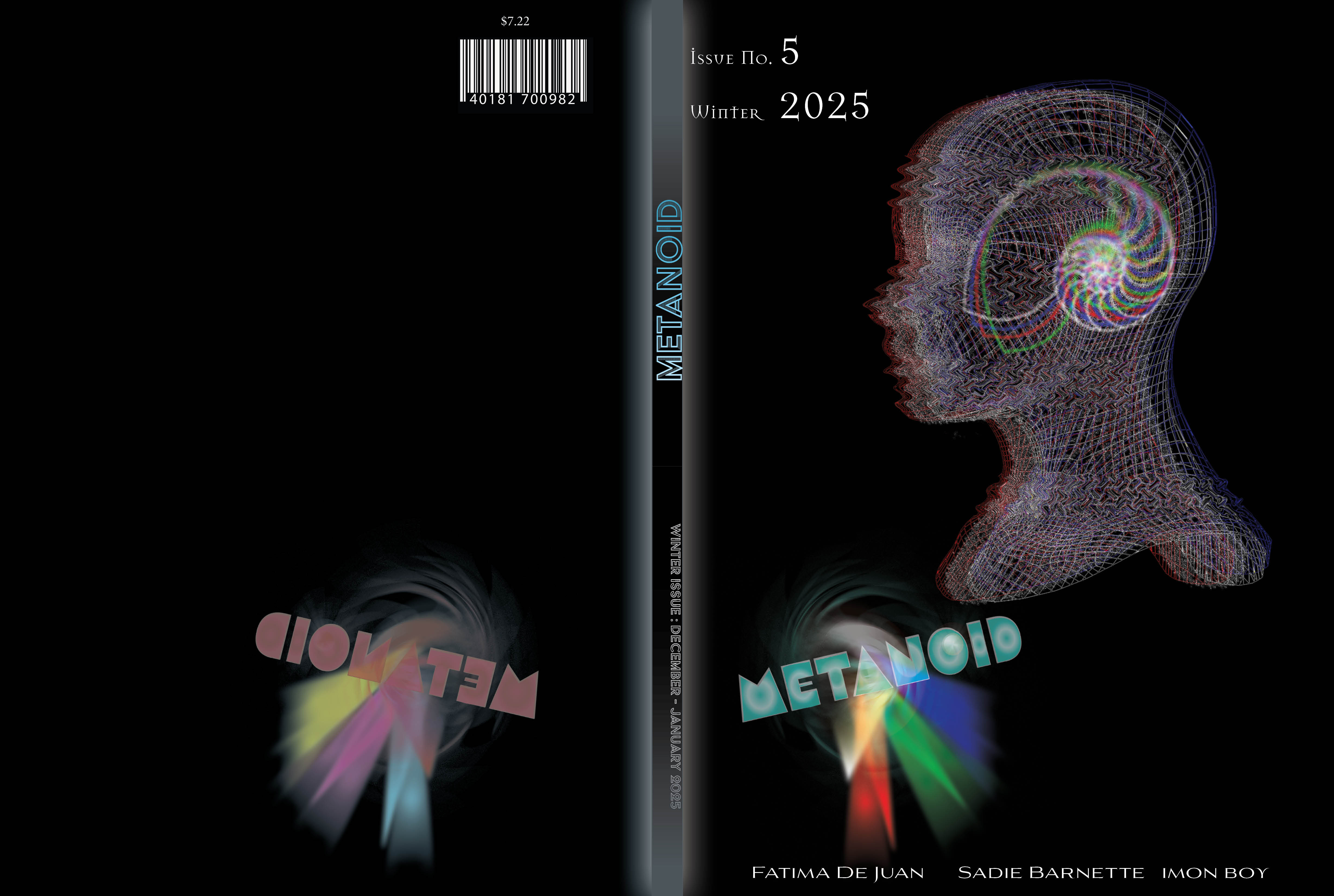
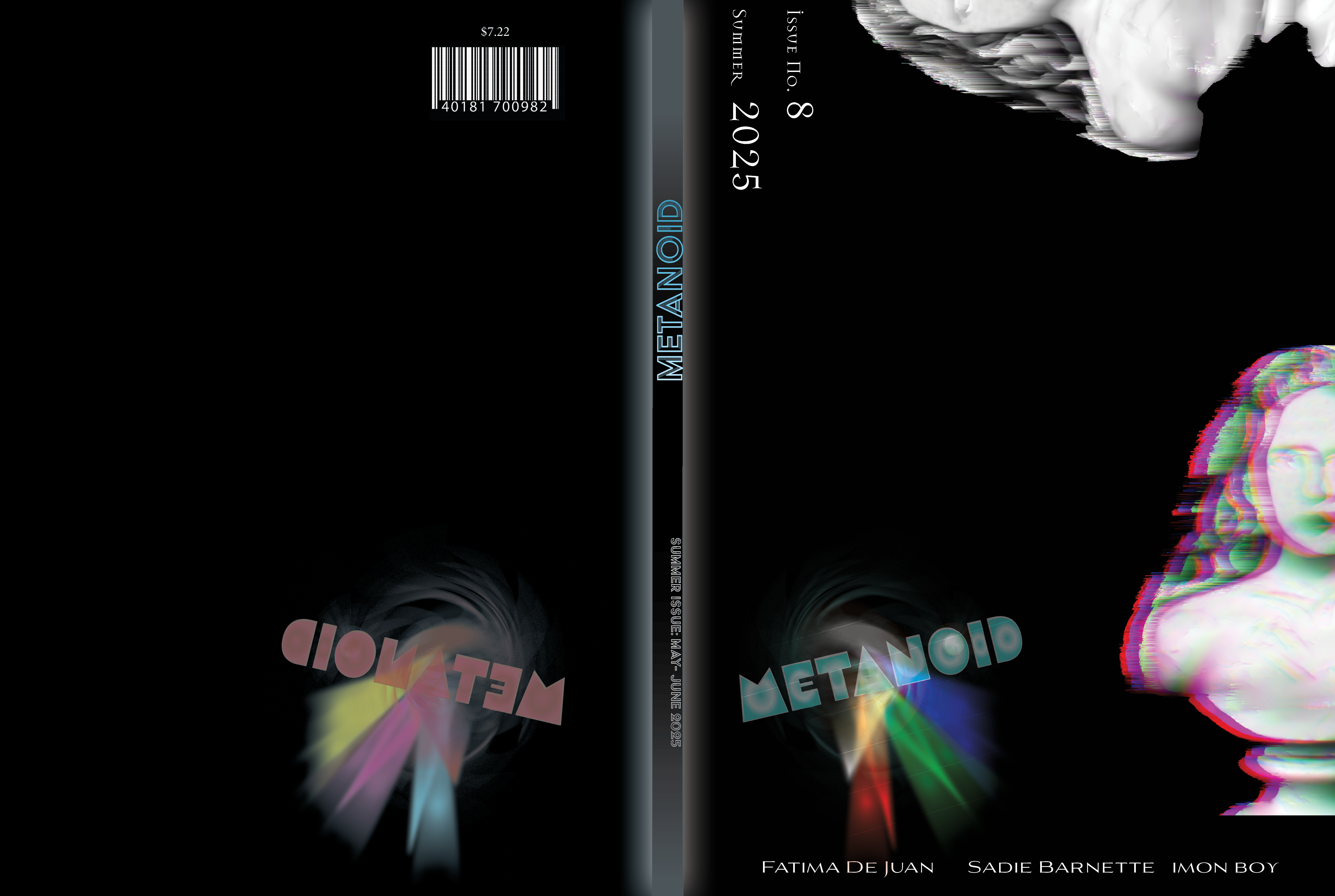
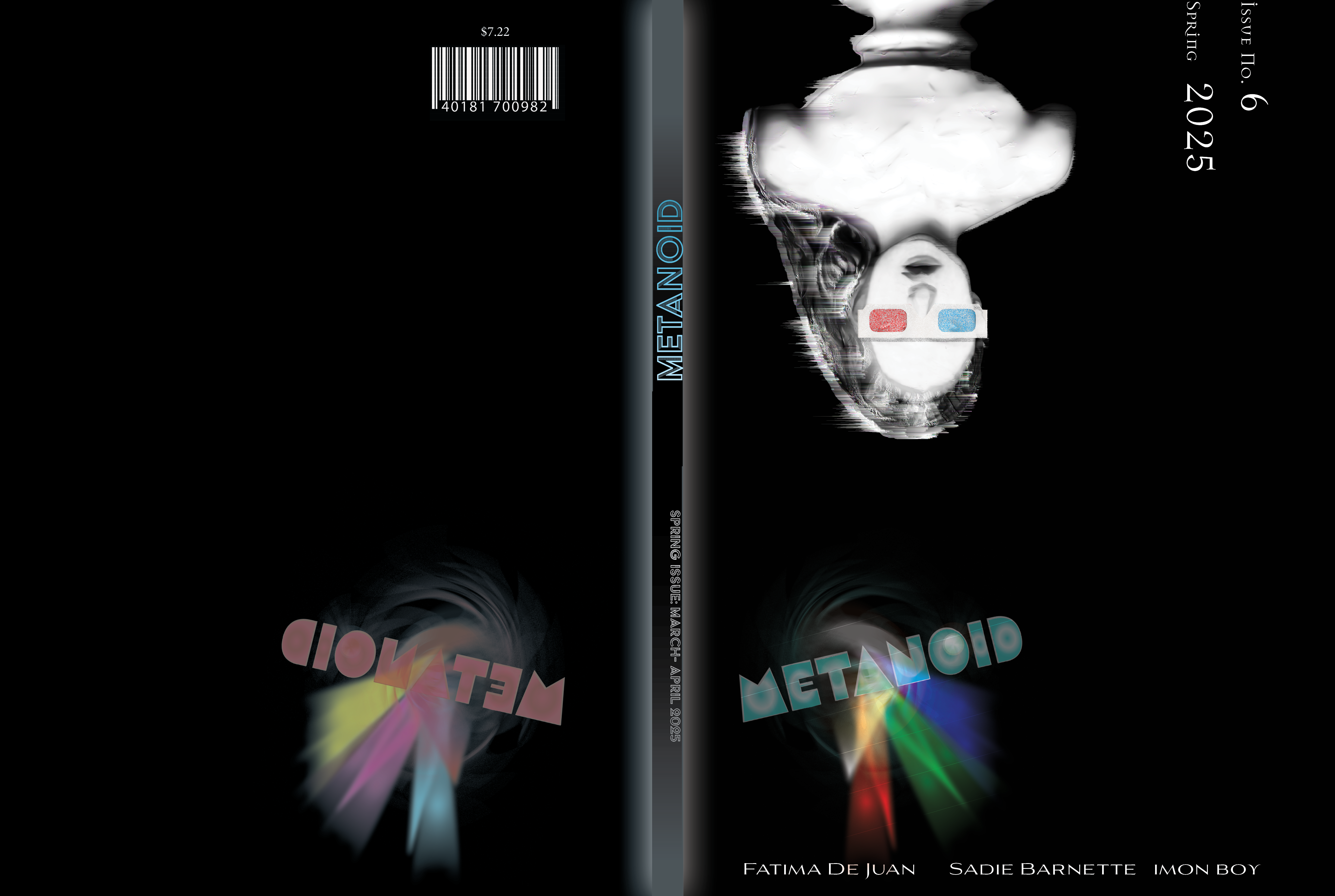
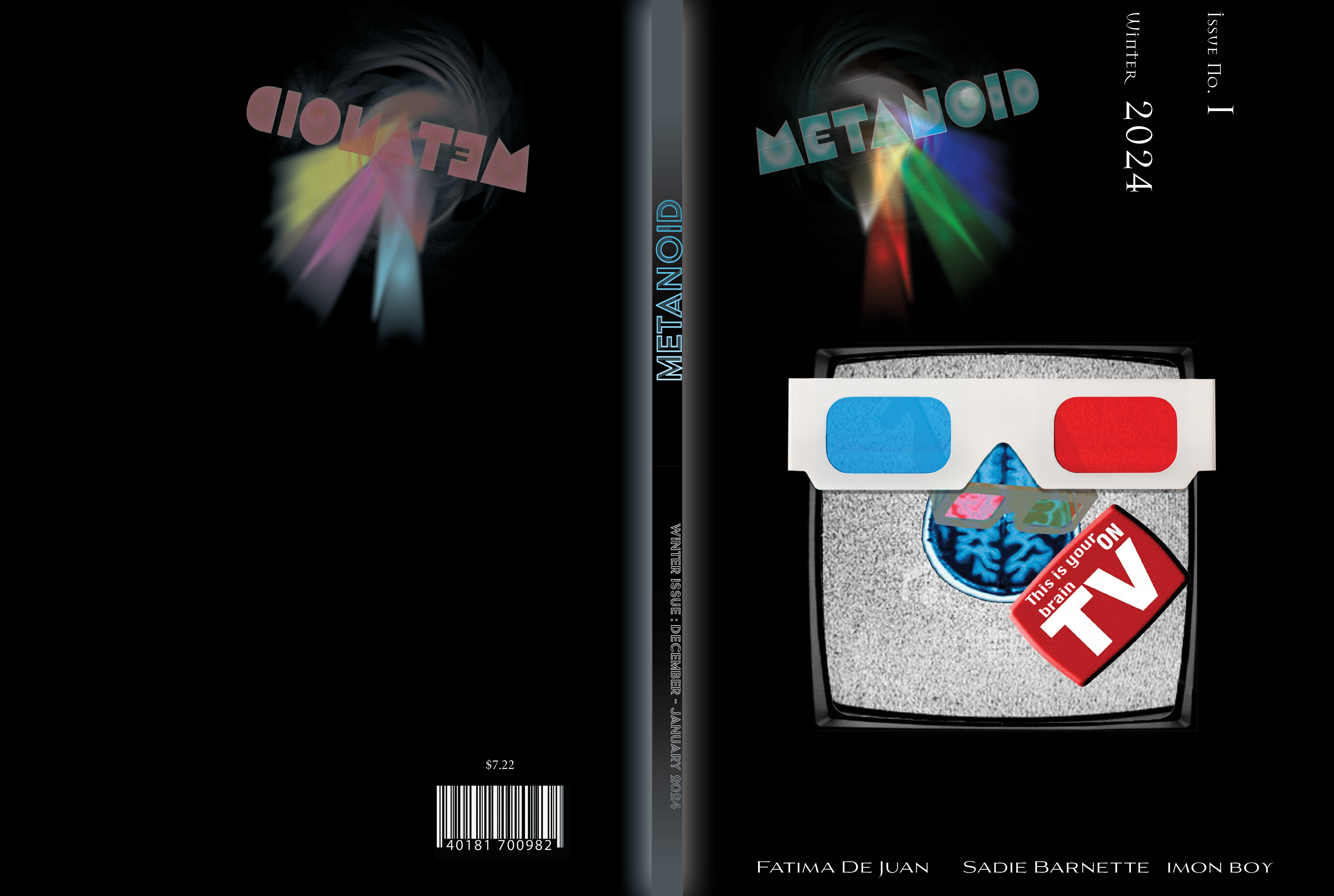
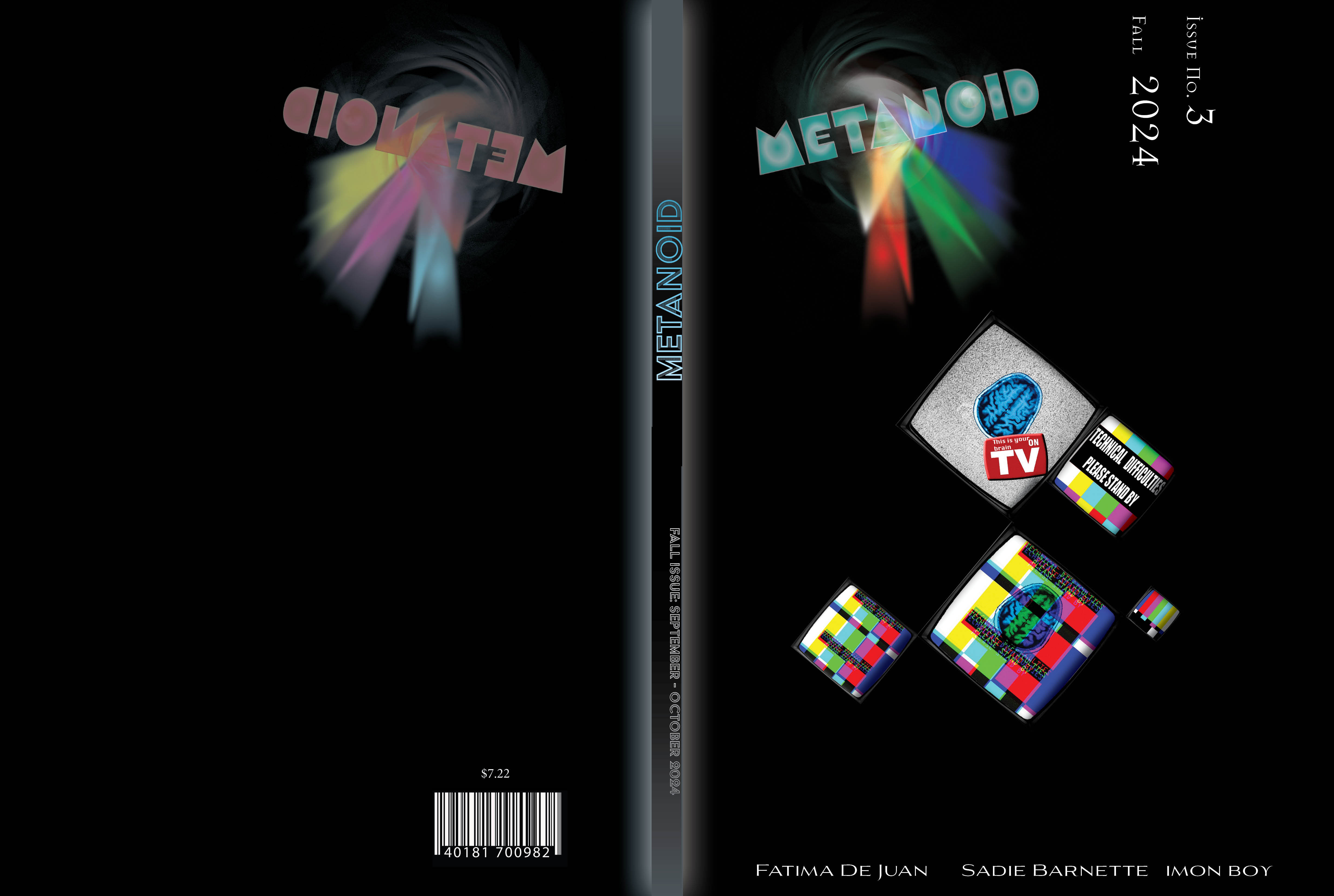
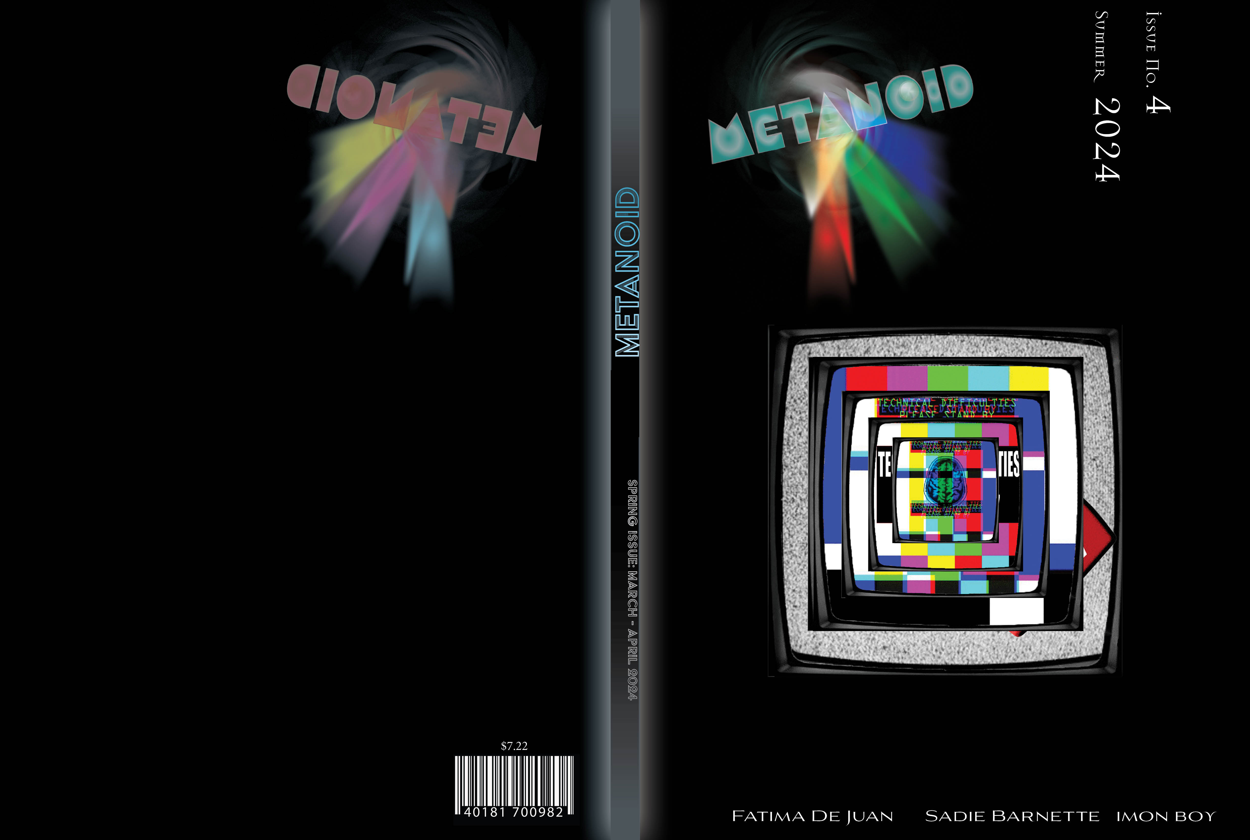
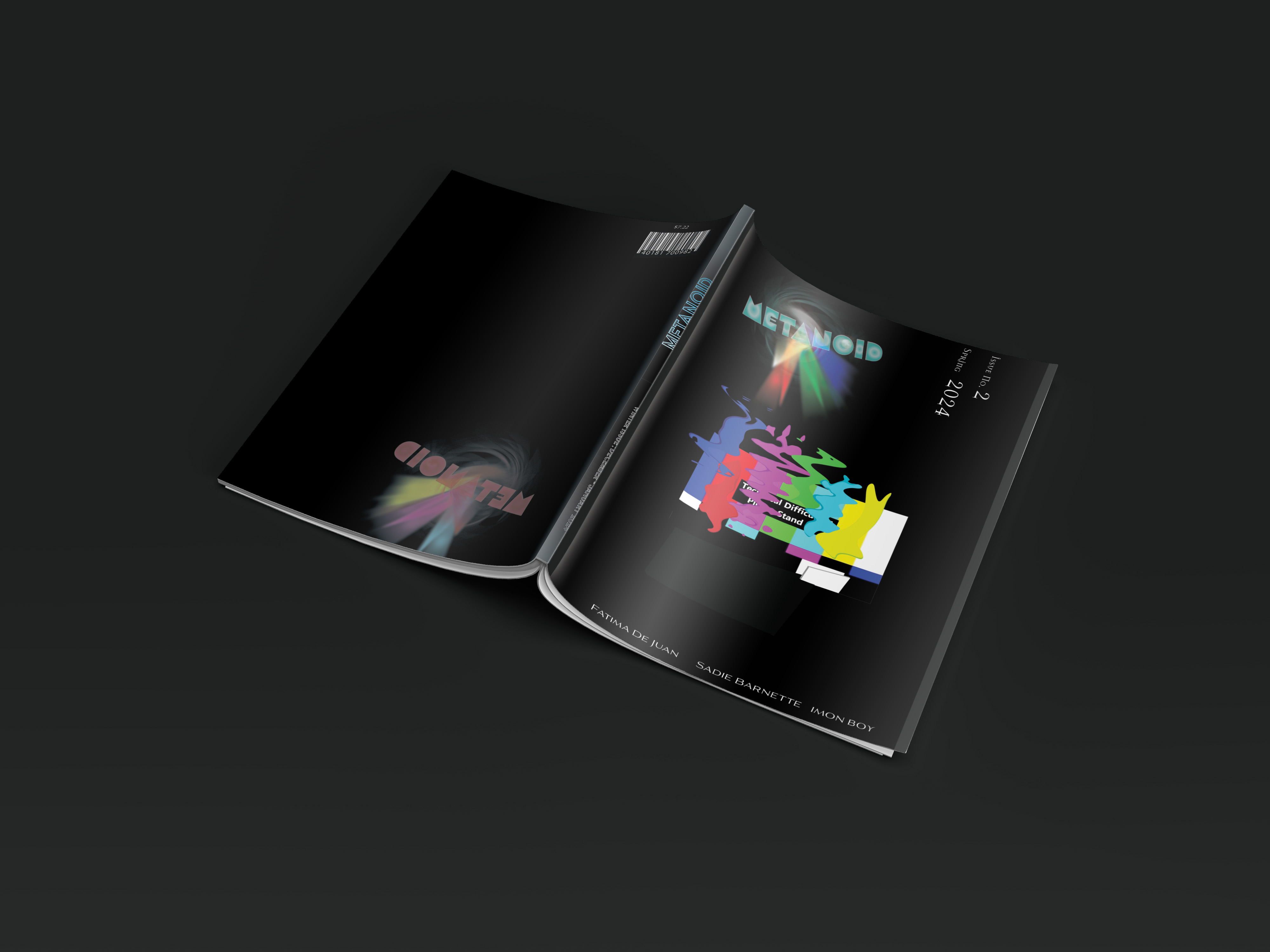
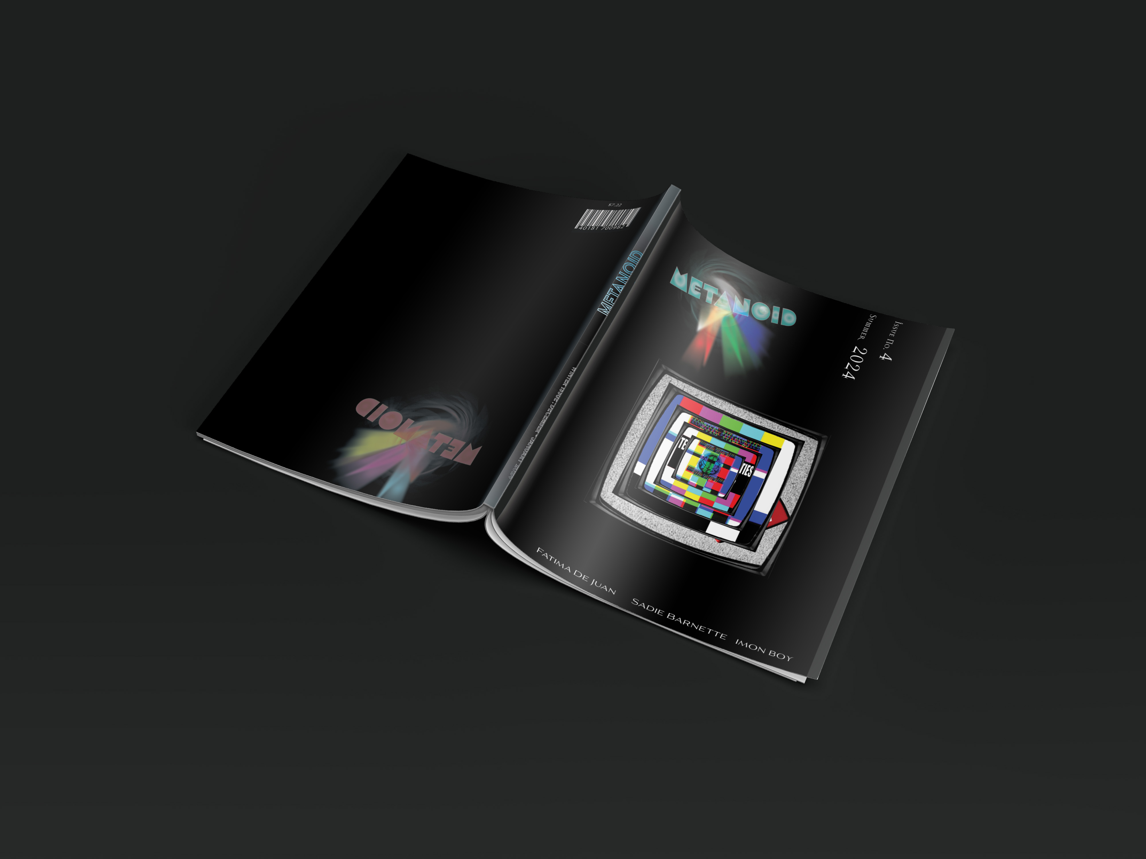
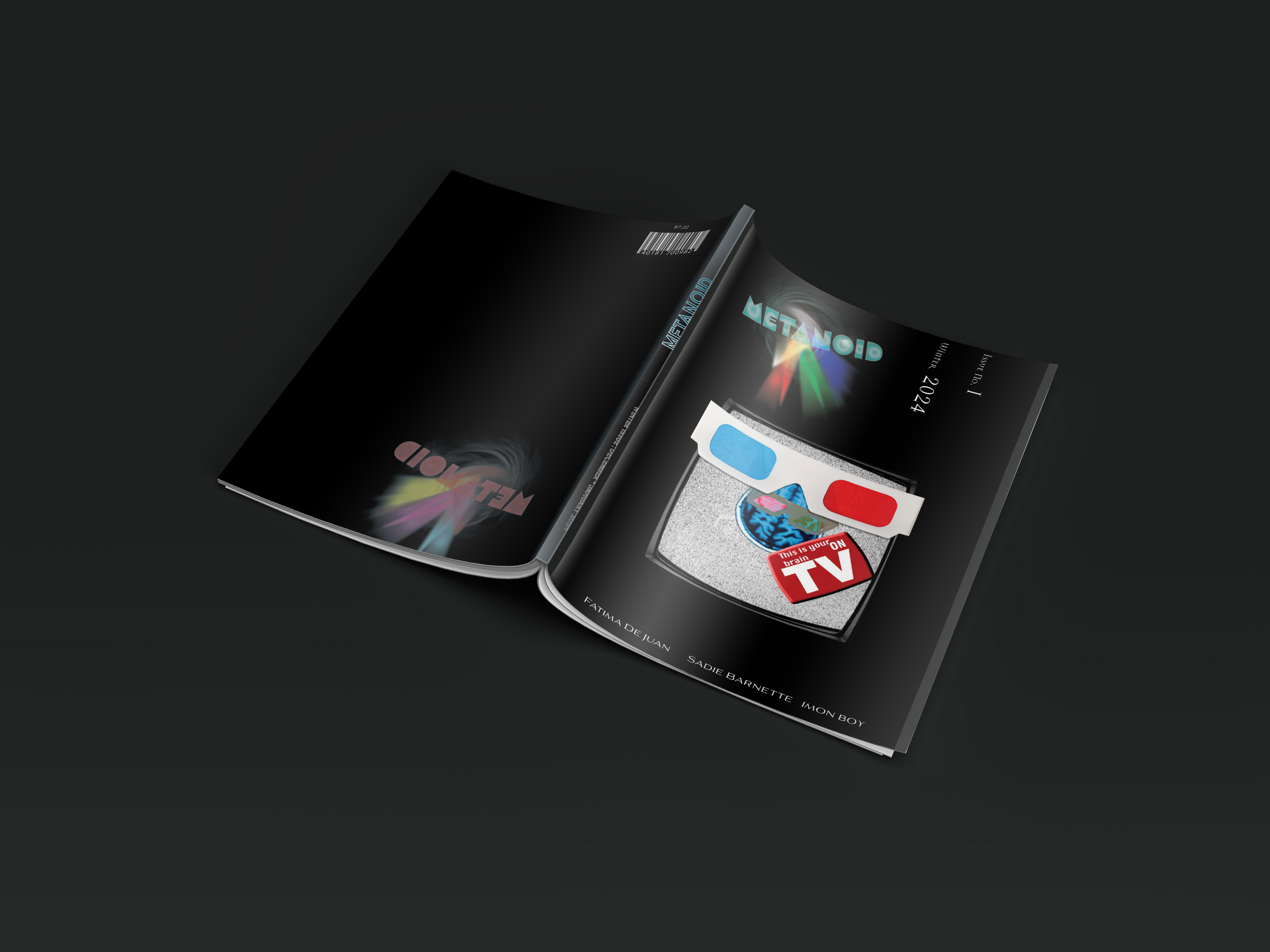
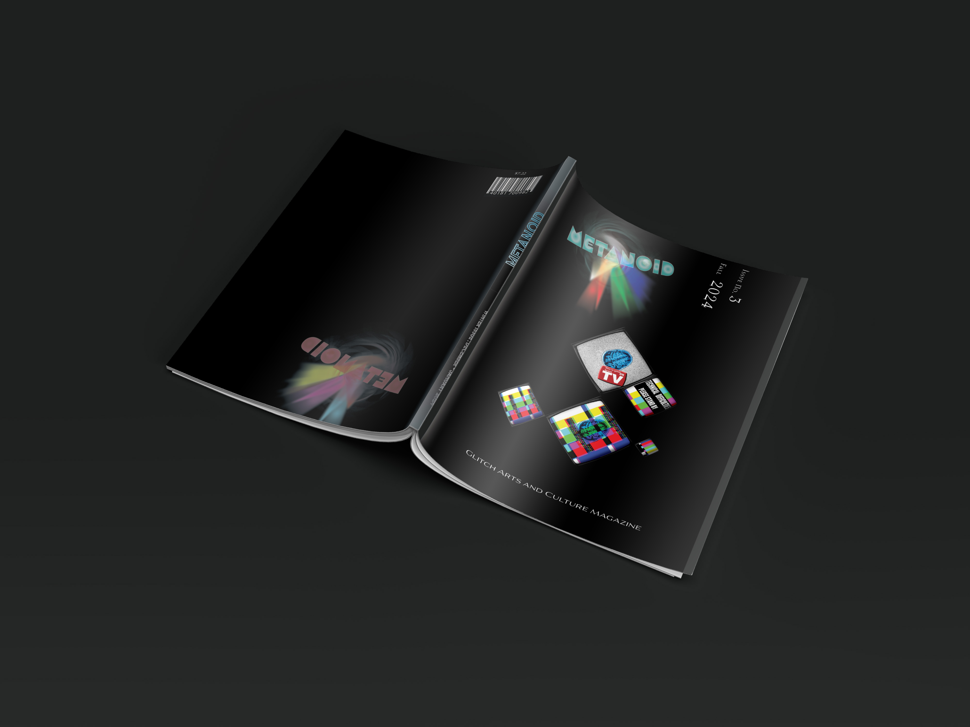
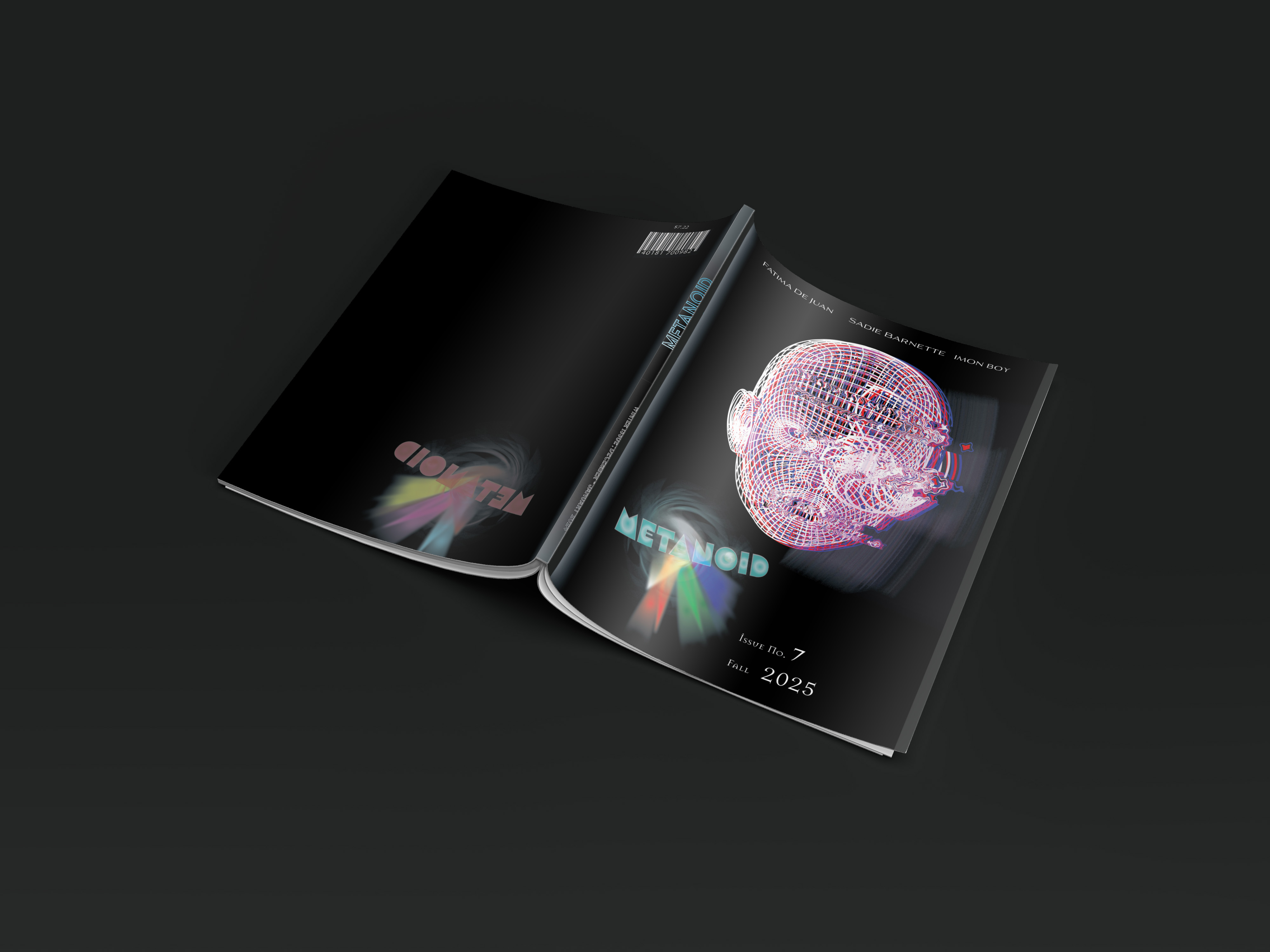
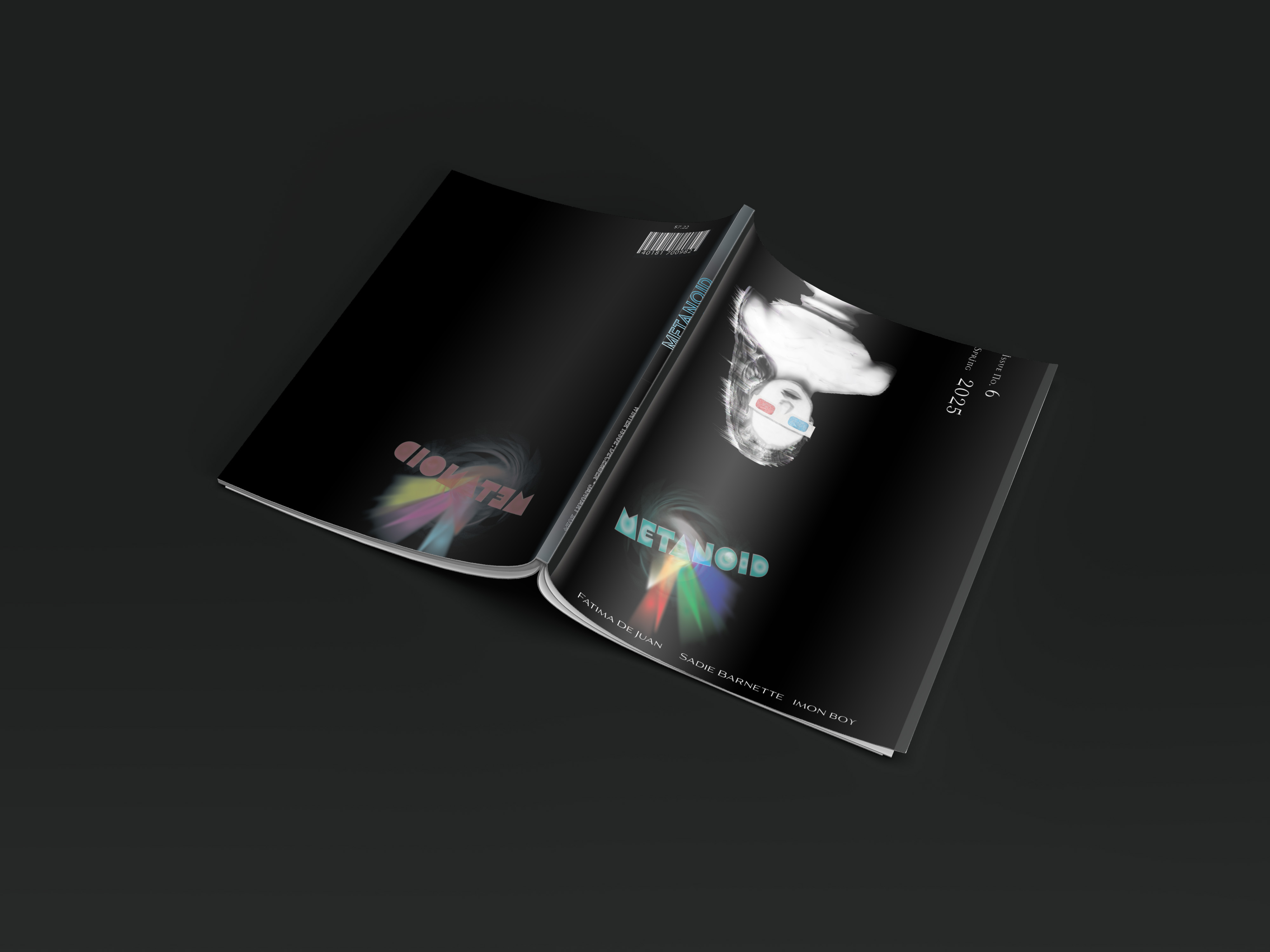
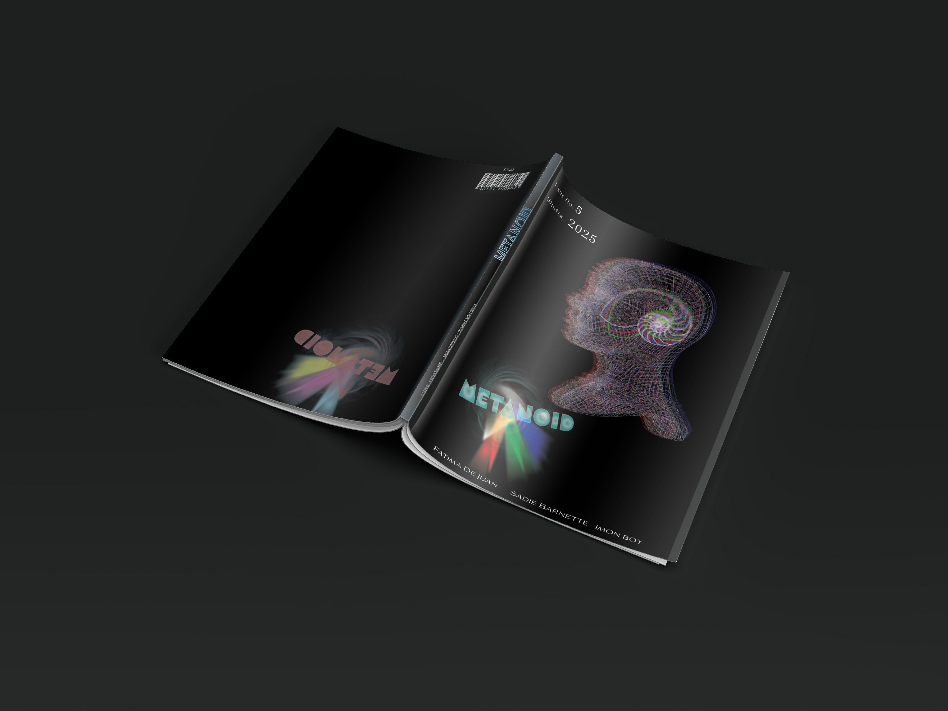
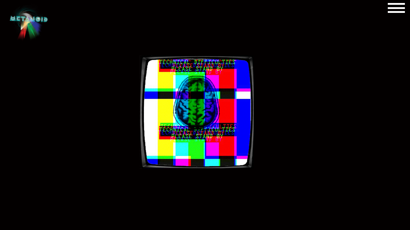
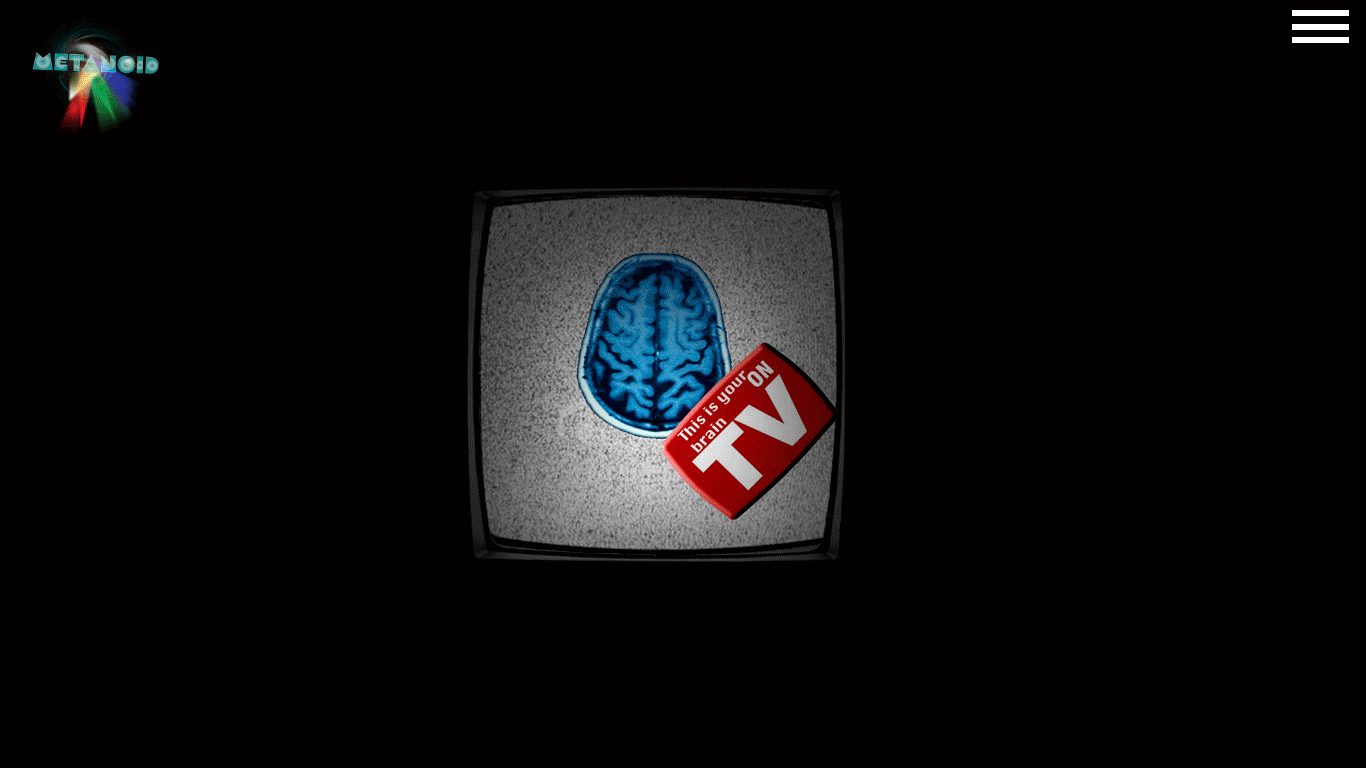
I started with sketching and rapid visualization of my ideas. Then I wrote notes around frames. From there I researched how to create assets as well as obtained stock imagery which could be edited to create glitch effects. I then created most of the assets (in illustrator) and manipulated photos (in Photoshop) and laid them out using golden ratio grids and templates, to show fractal proportions. I wrote content and laid that out as well. A lot of the assets and content were taken from the internet (but then laid out in InDesign) as a way to provide content for the main editorial sections based on my research. I took inspiration from Emigre, Plastikcomb, and Juxtapoz Magazines. Plastikcomb and Emigre for the experimental typography and layout, as well as gritty textures and irreverent style, and Juxtapoz for its structure. I devised main sections for my Design System for the inner pages which include gallery and event advertisements, artist interviews, gallery and event write ups and promotions, and art articles with full-bleed images of the art. This is an illustration-dominant magazine with no set typeface for the inner pages, but the layout and concepts can be iterated for the design system. Regarding the covers, the 2025 quarterly issues have the glitched out heads and faces/ upper torsos as well as the masthead on the lower third portion. The quarterly issues for 2024 feature glitched out TV’s in various arrays and the masthead is on the upper third portion of the the grid. All covers have the reversed reflection of the masthead and a horizontal list of the top three featured artists in the magazine.Design Problem:
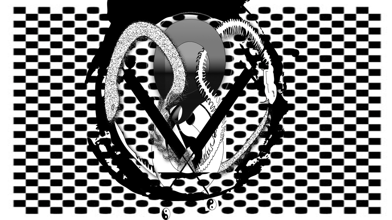
For this project, Glitch Art is a subject matter vary near and dear to my heart. I wanted to convey the enthusiasm and excitment for both die hards and those who only dabble in the arts. I want to have a bright yet neutral color pallete, being grungy while also being sleek and modern.
Design Solution:
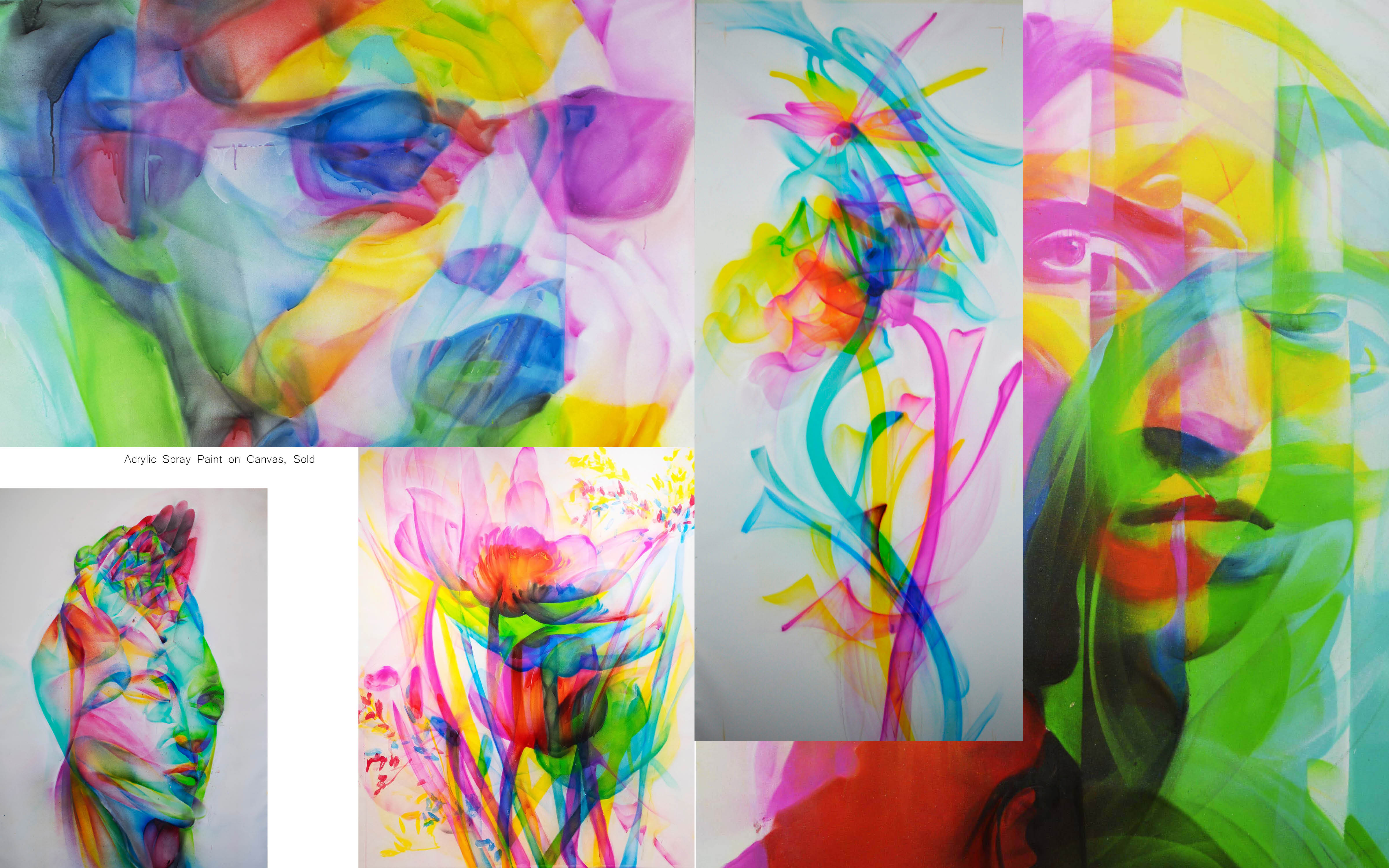
The magazine covers have stark black backgrounds with pops of color, while the inner pages have bright full bleed graphics and mostly white or patterned backgrounds. Some headlines are sheered and skewed, some body text is center-aligned. The articles themselves are thought-provoking whether real or fictitious... Maybe whether or not they are is part of the provocation.

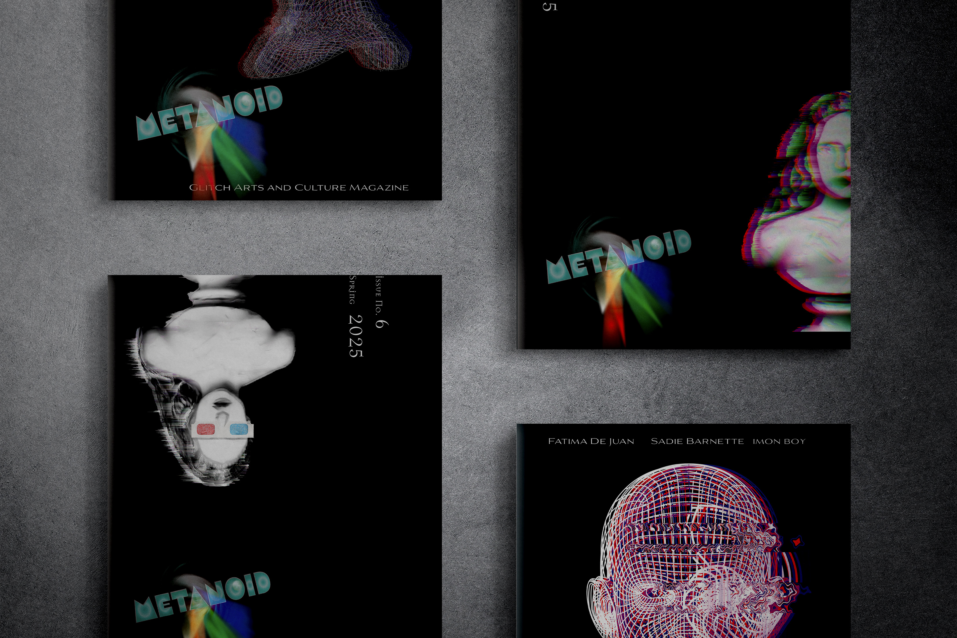
Magazine Covers 2025/ 2024


Responsive Website Landing Page Design
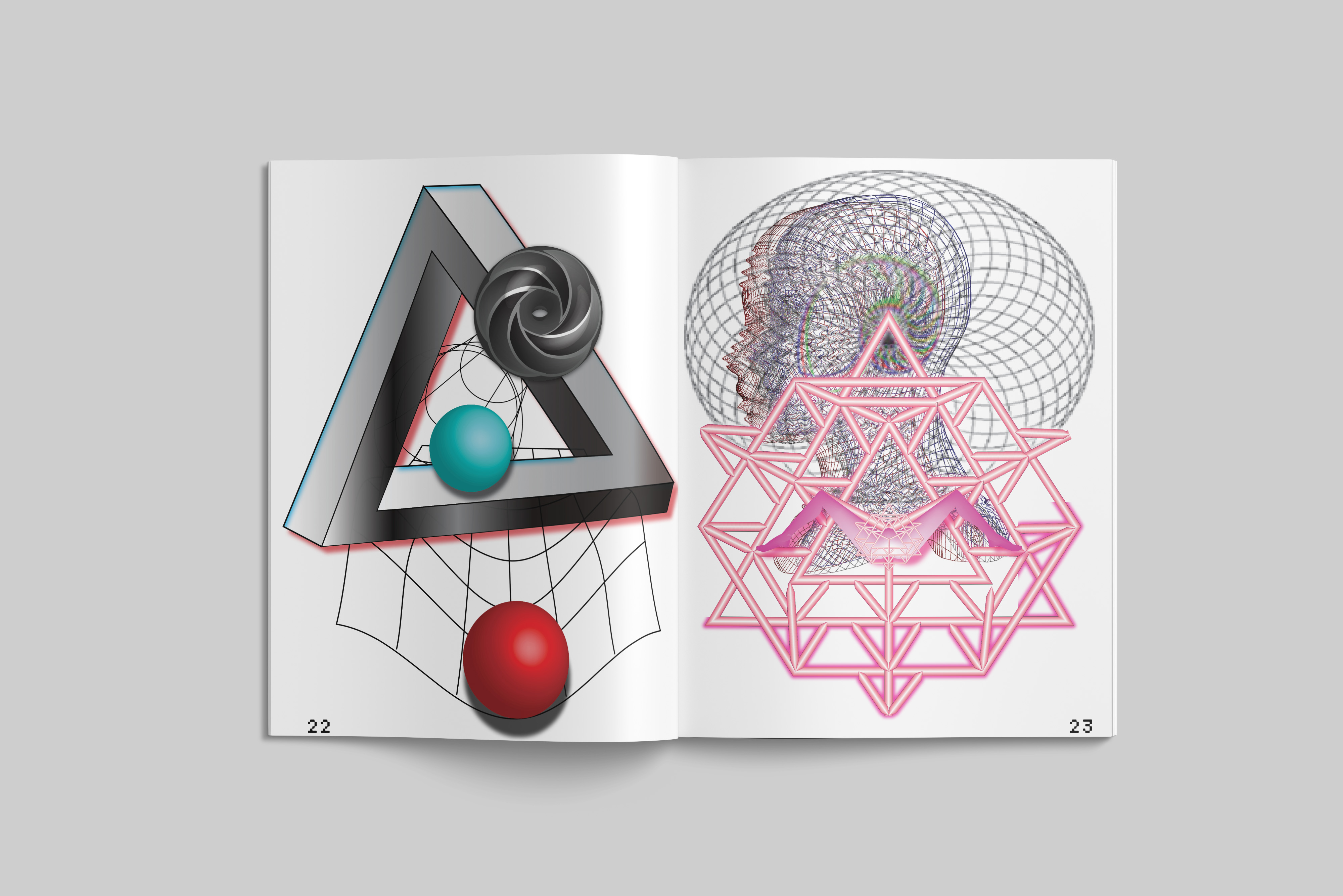
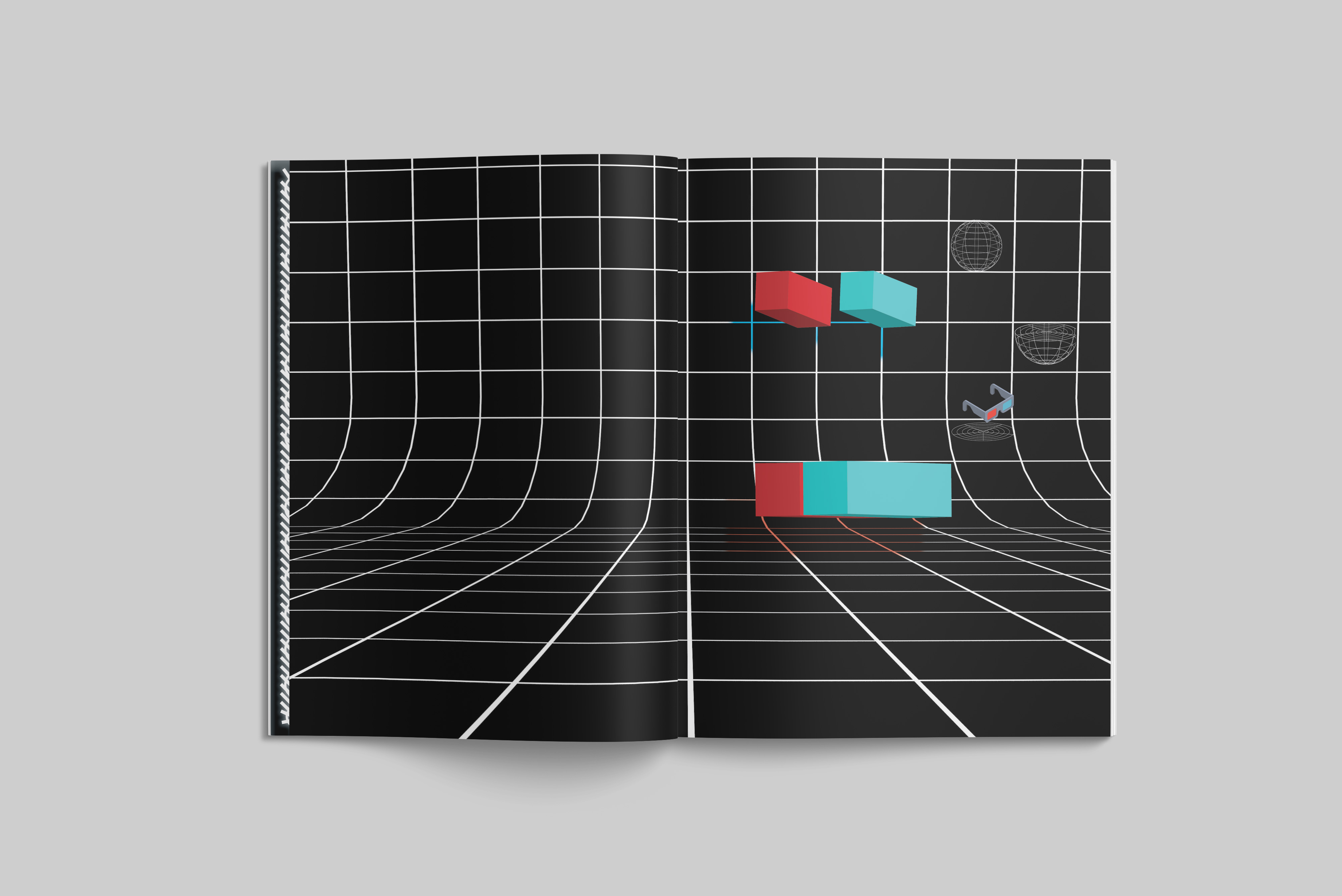
Inner Pages